http://www.acornrack.com/ohmercy/
(Any of you pick up that the image is widescreen!?!)
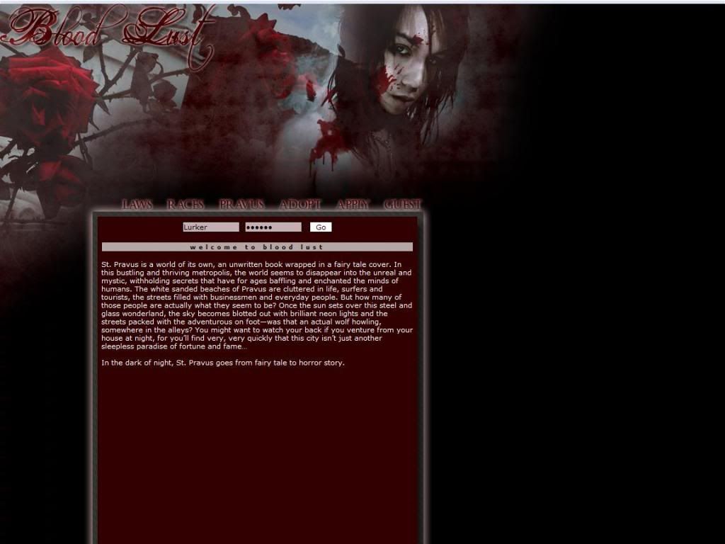
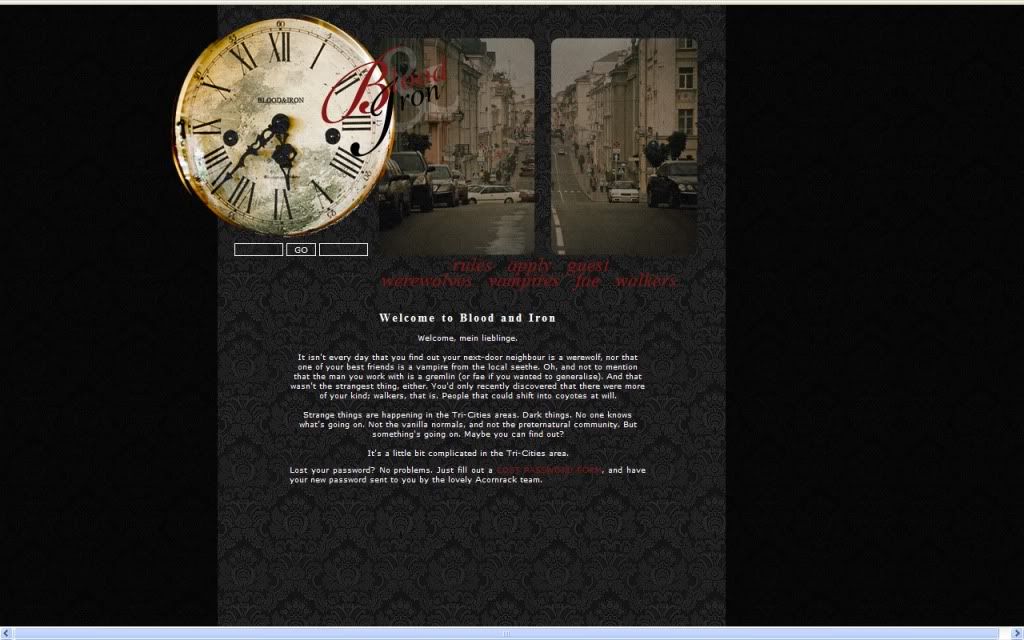
Alright my subjects it's time for another review on this fine day! I'm going to be taking a look at Blood & Iron a dark, vampire, wolf, werewolf RP based on the Mercy Thompson series by Patricia Briggs. A quick note that the person who submitted the site gave me the link to their AD which of course is always beneficial to me so I don't have to track it down. So if any of you are keeping notes before you submit your site, something to write down there...
Anyway! I've not heard of this series so I'm taking this site at face value so you can whine all you want about how it's not true to certain details and it will simply fly over my head. The AD for the most part is written decent, maybe it's just because I've seen so many of these sites now that I'm over the "You find more of your kind..." approach, but since it's based on a book series I guess I can't fault them there for it.
I've no funny or witty comment here to segway into the actual review... so, WAKKA WAKKA WAKKA!!!!
First Impression:
Someone better get rid of that 5 o'clock shadow! (Get it... there's a clock...) I have no real problems with the layout aside from one small nitpick. There is a link back to the index page however you have to click the main image. Maybe it's just because it's 12 AM now but I'd generally like to not have to search for the link back home.
The Public Area:
The index page is portion of the AD and as you all know (hopefully...) this is perfectly fine!
Werewolves page is overall fine though some places look like they might need some spacing in between certain paragraphs. But I suppose that's just a stylistic preference on my account.
(Grammar: Last note on the Vampire page. "...excepting AIDS and Cancer" )
I'm a bit confused on the Fae's... are they humanoids or ogres or what now? You name all these things and names but I don't know what the true form of these people are... or I missed it. In either case it probably needs to be more prominent.
(Grammar: Walker's page "... ability to scent out emotions.")
The Application:
The application is rather basic and it's my preference to be able to weed out those mary-sues before they're on the site rather than afterwards due to this. RP SAMPLE REQUIRED.
The Private Area:
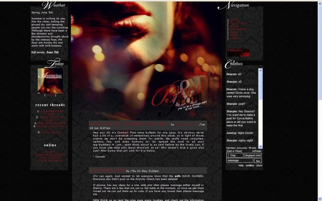
Layout Change! There aren't any new information pages that I see but the new layout is nice and fits in with the old one as well. Since there isn't any pages to comment on, it's a good time to point out at the time I was looking over the site there was chatter in the cbox and members online.
Forums:
Good amount of forums and nice descriptions here however it's time to play my old record that there should be hotlinks to each section. Again here also has where I think the forum descriptions should be spaced out more from each other but another stylistic choice I assume. Also the layout of the name, poster and description will take some time to getting used to as they are scrunched together.
Other:
Member list looks nice and give you a link directly to their history application link but otherwise you get the normal info and avatar.
Member profiles are generally nicely filled out and well organized, with multiple picture slots and other fun stuff.
Roleplaying:
From what I read on the forums I categorize the roleplaying on this site to be Intermediate to Advanced.
Rating: 7 out of 10 Points.
Overall a good site, just little things here and there that took things away. Also with the boom of vampire sites and other dark RPs probably on the rise with Twilight and the like the Fae's and Walkers gave a small sense of individuality but for me even that wasn't enough.
Reviewed by: The Jello Emperor