Woof [7.0/10]

|


Greetings and salutations to all! As I promised here is the review that is LONG overdue, I suppose you'll have to forgive me for being a little rusty as I've been thrown into the lovely world of college and school work once again. BUT FEAR NOT! I shall move forward on with this little blog of mine and rate where no Jello Emperor has rated before!

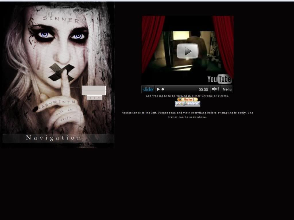
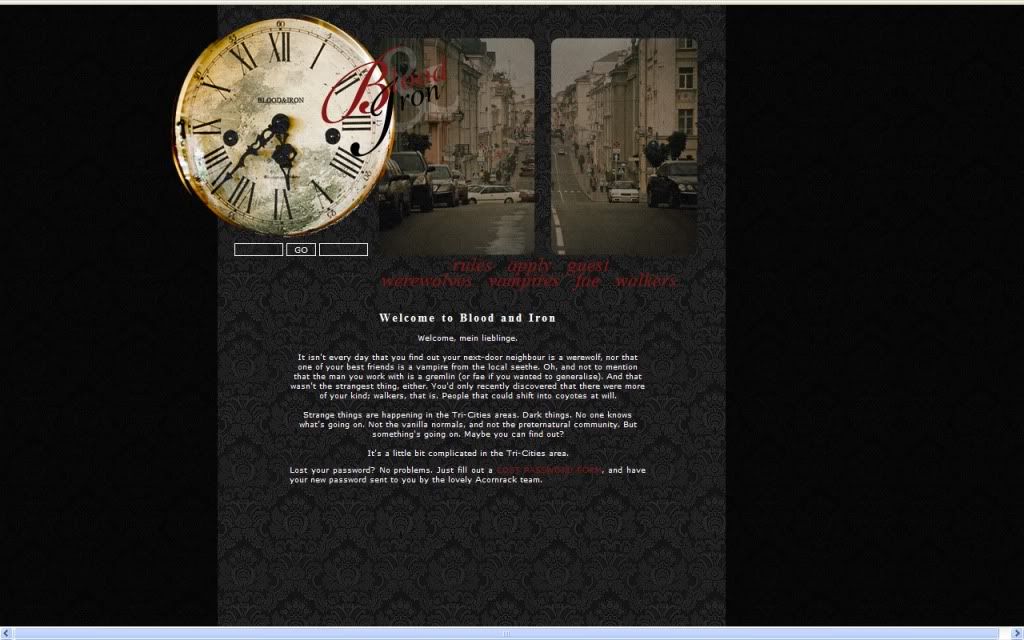
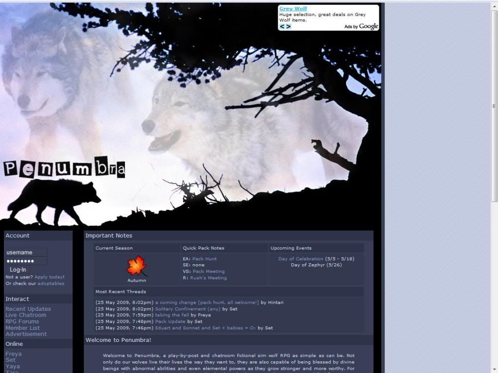
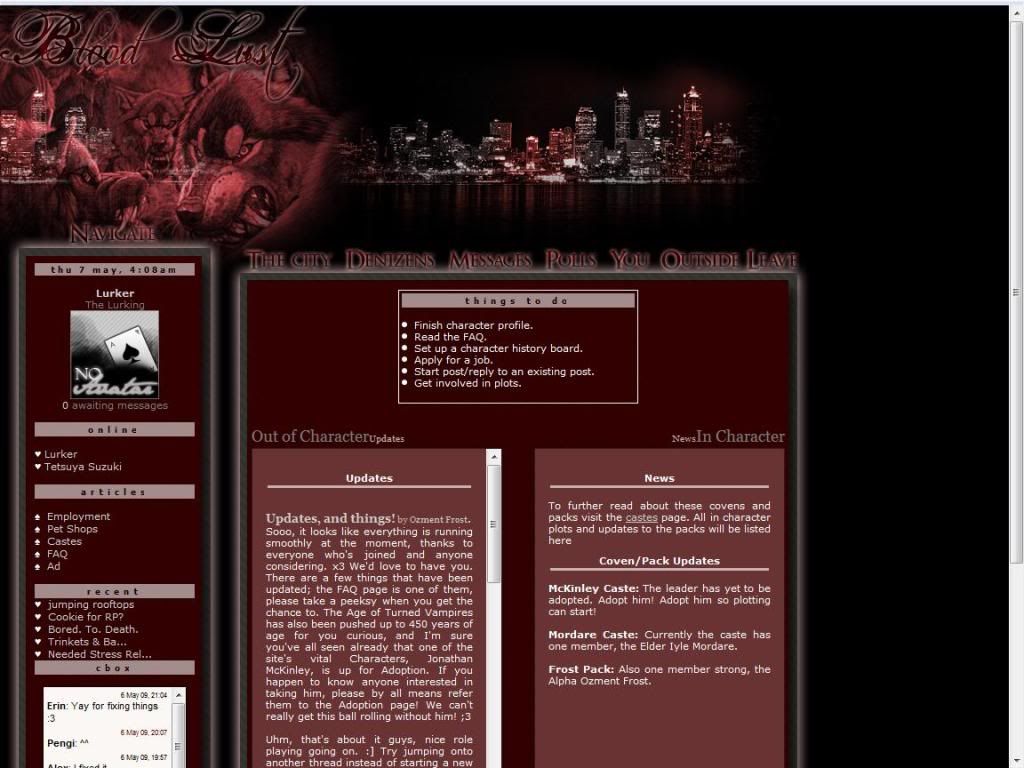
... And now with that little thing out of the way... WOOF! No, I mean the site Woof! This site is probably the first werewolf site I've rated, yes I said werewolf. Wolves and horses are aplenty but werewolves I haven't seen much of personally so this will be a good venture for us all.

So the AD here, is fairly basic which is fine and I see they have site stats and such and overall I have no problems with a basic AD. It seems though that there are parts where it looks like a new paragraph and I'm a stickler for indenting those paragraphs but I think that it would just make it look a little nicer.

But toss your garlic necklaces into the trash bin because this is Werewolf county, punk! Grab your silver coins for good luck and walk softly and carry a large silver sword right into the review! (Jello points to anyone who gets that reference...)
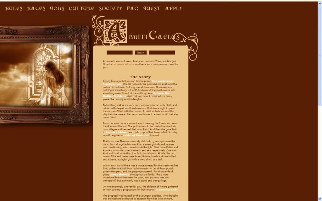
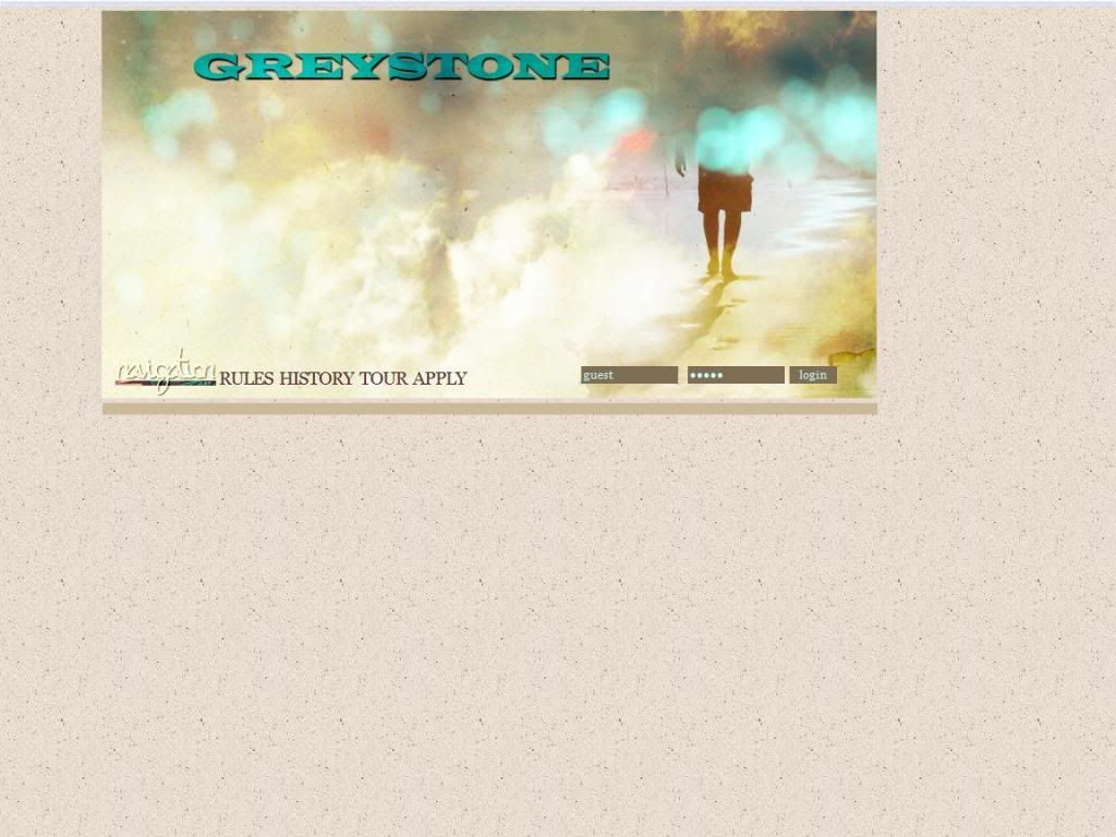
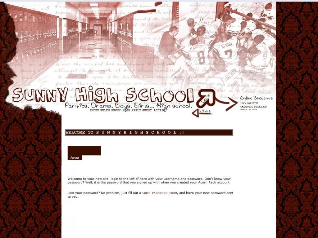
First Impression:
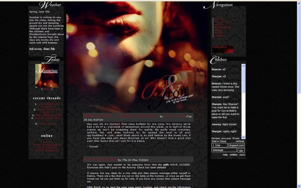
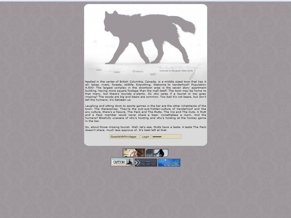
Quick little personality test! Take a look at the wolf picture, is he looking away from you or looking at you? Post in the comments and let me know!

Anyway, the layout looks nice and neat and I have no problems with anything. The site it self makes good use of screen real estate while still framing it to look nice.

The Public Area:
Rules page is overall fine, I do have a nitpick though. I'm not a fan of curse words in the public area, as it is public. Do whatever you want in the private parts but when you're creating an image for yourself keep it acceptable for a parent to peek at.

(Also, there are various spelling errors: Ralphie in rule one, lightning in rule two.)

Ranks page is fine.

Dynamics page is overall fine, just various spelling and grammar errors strewn about the page.

The Application:
Your standard application, so not much to say about it.
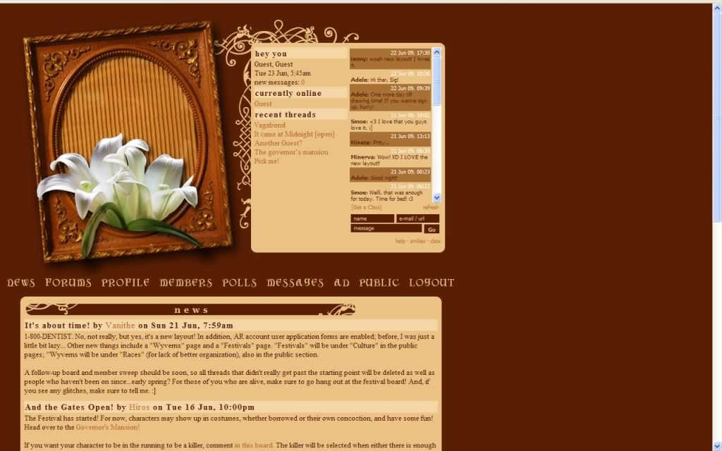

The Private Area:
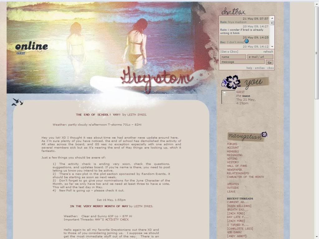
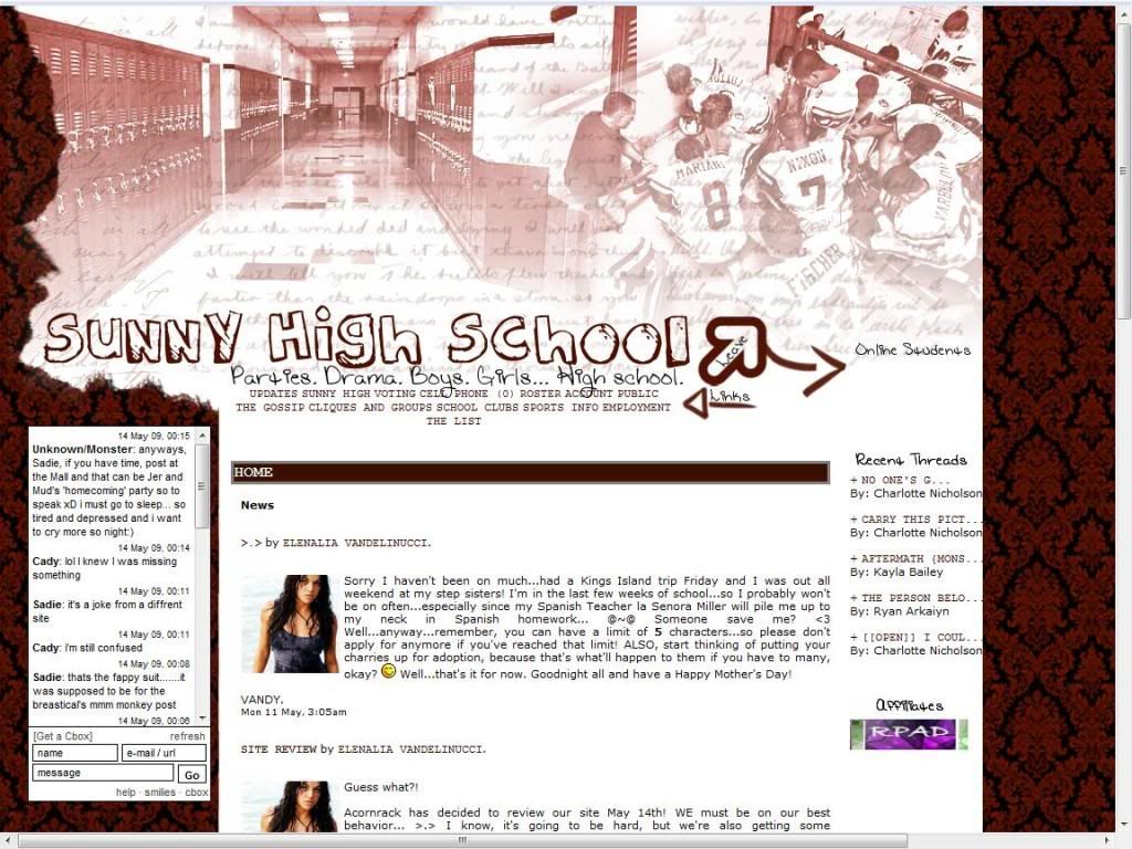
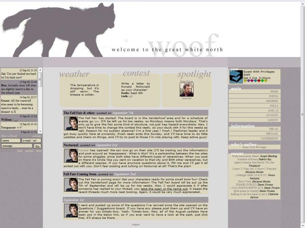
Layout Chaaaange! Well, actually it's more like an expansion but nonetheless the layout is still simple and provides everything you need on initial screen load. The space is used again efficiently so I have no problems.

There is very little information that's new in the private area, site setting and pack meetings and such so most of the info you need is in the public area.

Forums:
Good amount of forums and nice descriptions and of course I love the hot links, overall I have no problems with the forums. I do like how the forum posts look like speech bubbles though.

Other:
The member list looks nice, divided by user level and avatar pictures for both the human and wolf counterparts along with general user stats.

The member profiles look nice and organized, are all the fields are generally filled out with the ones that I looked at.

Roleplaying:
From what I read on the forums I categorize the roleplaying on this site to be Intermediate to High Intermediate.

Rating: 7.0 out of 10 Points

Overall it looks to be a good site, takes advantage of the site layout well but even though I haven't rated many werewolf sites I didn't really see much innovation or something that would pull me into joining and fleshing out a character.

So concludes my foray back into the reviewing world, hopefully many more will be showing up!

Reviewed by: The Jello Emperor

Arcadia [9.2/10]

|


Howdy, howdy, howdy! How are ya? It's time for another review on this fine.... Saturday? Yes! Real life is always a bother at times so this review is coming on a wondrous Saturday! Hopefully these random extension days won't happen very often but enough about myself, you're here to read about Arcadia, a Pern RP!

Now I first let me say I know very very little about Pern, and have never RP'ed on a Pern website. So if I harp on something that makes total sense in the Pern world then feel free to laugh at my lack of knowledge and move on! (Pern is dragons, right?)

The AD for the site is nice and neat and this site is already after my own heart. "You don't need to know Pern" , well I'll fit right in! And this is a good example of even if you don't have a pretty image, your AD can be just as good or even much better than one with a flashy image.

Lets hop on our dragons, fry up that evil aristocrat and... YOUR WISH HAS BEEN GRANTED!!! It's time for the review! (Yes... my dragon reference was from DBZ. I told you I don't know Pern!)

First Impression:
Is this a scene from Gladiator? This looks like the Fields of Elysium. Anyway, the layout looks nice enough I personally would have preferred it if it was a bit smaller but it looks like the owner was trying to use up all the space which is fine.

The Public Area:
There's lots of information but I must say, I FINALLY KNOW WHAT THREADS ARE! I've looked at some other Pern sites before but for some reason the explanation of what the heck "Thread" is absent. Also everything is nice and neatly organized and its nice to see all this detail.

In the ranks portion of the information, I would like to have seen the actual rank names in bold, in the previous pages (to this point) there has been bolding so it seems odd to not have any on this page.

In the Dragon Descriptions I really like how you posted the colors, some of them are a bit hard to make out because of the background BUT I still love the idea.

The Application:
You get the rules and application guide before you can apply which is a good idea, and I have no problems with any of it. So to the actual application!

As like the site is, the application is neat and organized, having OOC, Character and Dragon sections.


The Private Area:
Layout Change! Everything again, looks nice and neat and everything appears to be on the the initial page load. There isn't any extra pages in the private area that I can see, but all the info you need is in the public area which is great (aside from like the Firelizards and Calendar page).

Forums:
The forums (as expected!) are nice, and organized well. I would have liked to see some sort of jumping between areas or using a script to divide and show only certain areas. Also the descriptions of the area are both in the forum list and the topic list which is something I've never seen before.

Other:
The Member list is nice and yet very simple, and of course is neat so it works well with the theme of the whole site.

Member profiles are very nice, giving you information in sections and using code to only display the certain portions you want. This also goes for the dragons, so it's like a section in a section with a section in a section....? It's good, that's all that matters!

Roleplaying:
From what I read on the forums I categorize the roleplaying on this site to be Intermediate to High Intermediate.

Rating: 9.2 out of 10 Points.

For those wondering on how this affects the rankings I'm bumping everyone else up a point. Consider it a "Mini Score Review" but this site deserves a spot in the top! There isn't really much bad I can say about the site except for the forums not living up to the rest of the greatness. So there you have it, another site reaches the 9's. This Pern site has a bright future so join it TODAY! ... I'll post the bunny picture again if you do!

This Site has the Jello Seal of Approval!

Reviewed by: The Jello Emperor

Serenity [6.7/10]

|


It's Tuesday so that means it's time for another Jello Review! Sorry I don't have an in-depth movie reference or random TV reference for today's site, but that's because today's site is... Serenity! And no, I'm not talking about the blind girl from the Yu-Gi-OH series (Hah! Got one in there!). Today site is another foray into the world of horses, herds, and territories.

First off I'd like to apologize if I start coming off a bit harsh, I've been battling illness so my annoyance levels are already high with coughing every 3 seconds. But anyway, the AD starts of honest in admitting that an equine RP isn't the most original! As always I skipped down to the bullet points first before reading the text, and so far it seems like every newer horse RP out there. Point system, herds, etc. I think the ability to be a domesticated or wild horse is new... but truthfully I lack the expertise to fully know.

Now put on those boots cowboy, saddle up and lets ride off into the sunset! .... After you read the review of course, of course, which this special horse will endorse, of course, the famous Mr. Ed!

First Impression:
Tornado!! Antonio Banderas was looking for you! The only problems I see are rather small. I see no link back to the index page and the other one small thing I have is that I shouldn't have tried to read the blurry text on the main image, made my eyes hurt a bit.


The Public Area:
The About page I always love these pages, and not because I'm a closed in outcast of the social world and love to keep track of people I can talk to of the opposite gender.

(What? I go outside... when the sun goes down, SOMETIMES...)

But I feel that these pages help connect with members a bit because knowing a little information about the admins makes them seem a bit more down to earth which is both good and bad.

Rules page is fine except for one part, where you talk about posting images and stuff. Those who lack any HTML knowledge will not know to take out the asterisks so you should probably tell them to. (I realize some people can deduce to take out the asterisks but if you've read my reviews before you know my faith in humanity is lacking.)

The Application:
It's nice and simple, so pretty much what you would expect from an application.


The Private Area:
Artax did you run away from Atreyu AGAIN?! And layout change! It seems like the links are kinda squished together here though, most notably in the recent posts section. I suppose there really isn't much you can do about that though. I suppose it's funny to note that I had to look through the links twice because I forgot "boards" is another way to say "forums."

I see a few pages in the private area but I cannot access them so I can't go over their point system or anything. Going over the point system is probably what I was most looking forward to actually, but no matter we'll just move onto the next section!

Forums:
There is a good amount of forums with good descriptions, but it's just one giant text wall of pain. There is no separation between areas and like I said it's all one continuous text-fest. Again it seems everything is squished in a little area so perhaps an expansion of the layout is needed to benefit the site as a whole.

Other:
The member list is just your basic list, not really anything done here to spruce it up. So probably something to look into.

The member profiles are at least organized very well because as I picked some random profiles there weren't filled out at all.

Roleplaying:
From what I read on the forum I categorize the roleplaying on this site to be Intermediate to Advanced.

Rating: 6.7 out of 10 Points

First of all make note that I'm giving them a bit of slack, compensating a bit for my irritability while being ill. Most likely if I was able to see the point system it would be a solid or close to 7 rating. Overall the site seems to be in the cookie cutter mold of horse RPs. I'm not really saying this is bad, but I didn't really see anything new or exciting on the site.

Reviewed by: The Jello Emperor

Water Frontier [7.3/10]

|


Space: The Final Frontier, these are the voyages of the Starship Jello-prise. Its everlasting mission, to bring order to the Acornrack world. To seek out new innovative RP ideas. To boldly rate all sites where no man has gone before.

*cue Star Trek:TNG theme*

Okay, okay that was a long intro but it DOES tie into today's review of a RP site called Water Frontier! This is a space cowboy or space pirate RP that will probably cater to the fans of the anime Outlaw Star or Cowboy Bebop and if you're not sure what those are perhaps you should read a review of it... from a certain group on AR tentatively called The Acornrack Anime Rangers (That means the name might be changed!), that a certain someone is contributing on.

Anyway, the AD for the site is nice enough. The picture is neat and the story block is.. well a story block. This site really does remind me of Outlaw star kind of... but maybe that's because I just watched it a few days ago.

See you Space Cowboy... as we hyperjump into the review!

.........KAAAAAAAAAAAAAAAAAAAAAAAAAAAAAAAAAAAAAAAHHHNN!!!!
(I know you were waiting for that one!)

First Impression:
I'm starting to get thirsty... But I think this is one of the few sites that has a more light color scheme, and to me it kinda looks like a website for a water plant. If you don't read any of the text anyway, like "Water Fronter: Your leading water purifier and provider in the Arizona area!" (No I don't live in Arizona) For me the layout seems a bit too stiff but for some it may work.

The Public Area:
For me the little blurb on the Index page is what I would have put on the AD, and used what's on the AD for the main story section for the site. Maybe it's just me but ADs that are short and sweet always seem to be much better in the long run because it's an advertisement and not a thesis.

Ranks page, there isn't really a problem here just that I was surprised that since this is a sort of a "Wild Wild Space" RP I was surprised to not find a rogue or freelancer rank. Someone who takes on jobs that are too political for mainstream companies that would damage sponsors and whatnot.

Rules page, one of my favorite pages because I get to whine a bunch! So here we go! Rule number one! You say use realism and then pull out the eye color thing, and talk about technology in the same paragraph. So have multicolored contacts is a no-no? Or a formerly blind man from an accident who has robotic eyes that happen to reflect and act as a mini-prism! I'd argue that mankind would invent cosmetic luxuries before decent space ships any day.

And I'd probably rather play an alien of some kind instead of a human in a space RP, because it's spaaaace! So perhaps you should look into that as a suggestion.

Otherwise everything else looks fine.

The Application:
Neat and organized and generally your standard gambit. However, the RP sample actually has a small backstory so you're not just thrown into a whirling poop-storm of confusion and misery! So nice touch there.


The Private Area:
Layout stays the same more or less just the addition of the cbox on the left hand side if you look at the picture. Anyway there isn't any private pages to look at that I see so we shall move onto the next section!

Forums:
Good amount of forums and descriptions and I like the divisions and pictures and things. Overall all is good, no problems here!

Other:
Member list is a little different in that you just see the avatar picture with their name underneath and their rank and faction while being sorted into pirates, tankers, or civillians.

Member profiles are generally filled out well and organized nicely also. but more or less the same as you'd see in any decent site.

Roleplaying:
From what I read on the forums I categorize the roleplaying on thie site to be Intermediate to Advanced.

Rating: 7.5 out of 10 Points.

Overall a good site and even though it's taking on a genre that I don't see much of, it's what exactly I'd expect it to be. Which means I'm saying there isn't anything I found to be outstanding or anything that made think, "I didn't think about doing it like that." or anything of the sort. Probably a huge hit with any Cowboy Bebop or Outlaw Star fans though.

Reviewed by: The Jello Emperor

Riylon [7.9/10]

|


Holy month-of-absence Batman! Yes, after a month of whining about college and school and stuff I AM BACK IN FULL FORCE! ....Okay not FULL force but I've decided that one month is WAAAY too long for me to stop posting so here we are, with a review of Riylon! Riylon is a fantasy, (mostly) freeform RP that promises loads of fun with 20 different races! Yeah I'm a bit rusty, can ya tell?

Anyway, the AD for the site is alright... truth be told I actually directly went to the points that were written out before I actually read the backstory. But when I did read the backstory it was more or less fine and dandy.

Let me put on my sexy leggings and lets grab a few customers, shall we? No? Well lets just get into the review then!

First Impression:
For some reason I feel like playing Dune... While I assume this is stylistic choice, the page is brown and... yeah. I don't have any real problems with the layout on functionality just that so far all I see is brown. Also, the little text there, I assume there trying to portray something deep and profound but isn't that the DEFINITION of darkness? But I digress, lets move on.

The Public Area:
The Races page is particularly impressive, I do have to admit that I didn't read through ALL of them. However, I am confident that if they spent this much time on them they should all be very well detailed.

The Magic page is also very nicely written as well, and now I feel like playing Magic: The Gathering (You hear that Wizards of the Coast, I play the game and you can sponsor me! ... HEY! Don't you be Jellocycling me!) Anyway, the magic page is nice.

Everything else in the public area seems to be peachy keen and I have no problems or anything outstanding to report on. So we move on to the next section!

The Application:
More or less your standard gambit, so no odd snafoo's or flashy shinies to report on. (I think I've reached my limit on odd random words on this article!)


The Private Area:
The Layout is just altered slightly for the c-box on the left hand side but it more or less looks the same! I don't see any new private pages to read and look over but there is a nice little affiliate thing in the lower left hand corner. So overall it's fine.

Forums:
Decent amount of forums with good descriptions for each forum here, I don't really mind the lack of hotlinks here because there isn't too many forums. If there are more to be added though I would suggest adding them in later to help with the navigation.

Other:
The member list is a nice and neat table with the normal things you'd find.

The profiles are nice and simple as well, but nice and neat. Overall they look nice without trying too hard to look flashy.

Roleplaying:
From what I read on the forums I categorize the roleplaying on this site to be intermediate to advanced. Though since this is my review I'm throwing in a few more cents, in that the way some of the posts are formatted makes it difficult to read.

Rating: 7.9 out of 10 Points.

Overall this is a good fantasy based RP I suppose it also have some post-apocalyptic tones and other genres as well if you pick the certain roles in the site. There are some good and detailed things here like the magic and the species that I really liked as well. Anyway like I said, overall good.

Reviewed by: The Jello Emperor

Labyrinth: Hell on Earth [8.9/10]

|


http://www.acornrack.com/lab/


All you peeps out there that didn't bother to watch me on Ustream will get to read this wondrous review of Labyrinth: Hell on Earth here on the web! This little wonder is a Dark, Futuristic, Religon... and some other good stuffs... RP all rolled up into one. Like a Wonder Ball! What's inside it? Who knows, lets eat the chocolate together!

So the AD for the site, I would have liked to see their name in the title.. so I could find it, but otherwise I love the little cartoon to make it look like ye olde cartoon times. Anyway the AD is good overall and there is a trailer for it but I really am not a big fan of trailers unless they're made by the owner with original content and not just a bunch of clips mashed together.

So.. it's time to go onward to the review! ... What, you want a semi-funny joke to segway in? Fine... What's blue and smells like red paint? BLUE PAINT! NOW ONWARDS TO THE REVIEW!

First Impression:
The secret is in the frosting, but I'll never tell! Anyway the layout is nice and compact, things appear and disappear... and then appear again.

The Public Area:
The first thing that comes to my mind as I read these pages is that the text should probably be justified, and the paragraphs I would maybe like them spaced out. Other than that it looks like it's overall fine. Truthfully though as I've read through all the pages at this point there isn't much for me to say except for I would suggest to justify the text. So lets move onwards to the next portion of the review maybe I'll have something to bash on in there! Oh wait, there is one small thing... the guest link doesn't work for me! I have to manually type in the guest/guest combination.

The Application:
The application is easy and simple, most of the profile work is done in the site.


The Private Area:
Layout Change Tiiime! Now there's another lady, but looks like she'll do more than just tell you that secret... she'll get you all cool with that fan! Anyway it looks fine, you can still see the news header in initial screen load so I don't really have a problem with all the things being so large. I don't see any private pages to look at but I would like to point out that the butterfly is a link back to the home page!

Forums:
Good amount of forums here, as well as the descriptions they have the hotlinks going down but none going back up so I'd maybe like to see that. Also I see there are special marking for who can go in where and whatnot, so if there's a way to make that more prominent I think that will help in the long run.

Other:
For the member list you get a list of pictures for each person on the site! This actually is something on what I consider to be ideal, you don't REALLY need to know post count and the last time they logged in. (Well the admins might but they have their own function in the admin section) All you School RPs out there take notice: Make your memberlist like a yearbook! Looks fancy and I think it's something rather new.

The member profiles are fancy with the whole javascript of things collapsing and such, maybe the basic portion could be automatically expanded since it is just the basic stuff. Oh and the member image changing thing is nice as well, just click the arrow and another picture! Lots of fun Javascript on the site... man if the code messes up I bet somebody dies in the mess of code.

Roleplaying:
From what I read on the site I categorize the roleplaying on the site to be Intermediate to Advanced.

Rating: 8.9 out of 10 Points.

Overall the site is great, little things here and there and lots of flashy Javascript. If you haven't noticed lately, the trend is if I have less to say and I'm more "filler writing" then you're getting a better score. It's just how it works, but anyway... just a few things here and there that I had problems with and some of them apparently are unable to be worked around so you'll just have to deal with it.

As I've decided to not have any duplicate scores once I hit 9.0, this is where Labyrinth shall stand. So Naveluce continues to be the 9.0 to beat, but this was VERY close. Get on that bilge Naveluce or else your 9.0 ship will be sunk soon...

This Site has the Jello Seal of Approval!

Reviewed by: The Jello Emperor

Felix Felicis [9.1/10]

|


http://www.acornrack.com/felix/


Hello my subjects! This is the long awaited review of...Felix Felicis a Harry Potter site! Now don't stop reading on me just yet! I'm sure this site has many things that separate itself from the other ones out there! Quick shout out to @MoonwaterBlu who is a follower of mine on Twitter! Those who are part of my social network have more pull when I decide to be lazy... or not.

Anyway, the AD for this site is short and simple. I think JACFC has a similar concept... or maybe that was another HP site, that basically everything is wiped and you just have the HP universe without the HP part. And as always I love the bullet points, 5 sentences is way too much information for me to process in one sitting... (Joking... mostly...)
Side Note: Can I claim a page for House Points for the Jello Faction?

Now I shall launch you into the review! Expelliarmus! *wave and a woosh and a BOOM!*

First Impression:
That telephone booth reminds me of the Wonka-vator! Anyway the layout looks fine overall and I have no major problems on first glance.

The Public Area:
On the index page is what I'd like to call the "Extended AD Edition" of the site. Basically what most people put on the main AD page is HERE, this is a GOOD thing. As I've probably said numerous times... my attention span is very little unless it is engaging. So if I personally have made it to this point the lore-y information is now filed under "engaging" or "important."

Rules page is overall fine, and I love the separate tabs for house spaces. And believe it or not that's the end for the public area stuff, not too much to take in and so far so good!

The Application:
Knowing what you can and cannot apply for comes first before you get to the actual application, and rats my personal favorites are gone. I was always an Ancient Runes or Potions Prof. I had fun doing the weekly lessons and stuff when I RP'd Harry Potter once upon a time.

Anyway, the application overall looks very good. Again with those lovely tabs! Still good and we're moving into the private area.


The Private Area:
Layout expansion! No major problems, everything is in initial screen load and again... I love these tabs! I don't see any new private pages to look at so we'll have to move on the next section!

Forums:
Gah! No super spiffy tabs for the forums here? =( In any case there are a good amount of forums and descriptions BUT they have the hotlinks which of course is the substitute. Individual post separation looks great as well.

Other:
Member list looks spiffy, everyone has their own little tab. The member profiles are very well done as well, lots of spiff and dish! (I have no idea what I mean there...)

Roleplaying:
From what I read on the forums I categorize the roleplaying on this site to me Intermediate to Advanced.

Rating: 9.1 out of 10 Points

Needless to say this site is very good! The only reason why it isn't any higher is because JACFC is the stopper. JACFC cannot go any higher in score because I cannot see the private area so the 9.2 slot will probably be forever given to JACFC. But anyway, overall this site gets a super high five? (Anyone want to think up a Jello catch phrase action thing?)

This Site has the Jello Seal of Approval!

Reviewed by: The Jello Emperor

Abditi Caelus [7.1/10]

|


http://www.acornrack.com/abditi/


Look what day it is! It's a good day for a review and that means there should be a review up on this blog thingy right? Well I best get to it then! Today I'll be reviewing a site called Abditi Caelus, a fantasy, elemental...y site that involves a bit of reincarnation of the elemental gods.

Anyway, the AD for the site is written well and interested me enough in the site itself but the text color is a bit light for me and I had to highlight the text to really read it. But otherwise it's a good AD, I always like overviews and such since with all the pretty words and fluff I tend to lose concentration. Sometimes... Maybe... Okay MOST of the time...

Maybe I should upgrade my status to Jello Deity! ... I'll have to look into that, but anyway onto the review!

First Impression:
Rapunzel, Rapunzel, Let down your ... hair! ... What'd you think I was gonna say? Crazy people.... Anyway I have no problems with the layout it looks nice and all the links are easily seen.

The Public Area:
The index page double functions as to where you can read the story in lore form, as opposed to the AD form and it is always a good idea to be efficient with pages.

Rules page, just a small note first of all if I haven't said it yet. Placement of the links and information is important, as it directs the visitor how you want them to see the site as a form of soft control. Anyway, rules are short and sweet. Also I like the whole "fade to black" thing, it's good visual reinforcement even though it is the rules.

Races page, text... there's lots of text. Which is good and bad, first of all I'd prefer hotlinks to each section of the races so I don't have to scroll down past everything to find what I really want to know. Also, I personally would have put the short descriptions first and then linked to the detail as opposed to how it is now. (The quick info should be hotlinked as well...) Oh, and even though it seems redundant a link on the quick info back to the detailed ones would be nice.

Note on Wyverns: Overall fine, not a fan on the whole land based horse wyvern though. Wyverns should be as they are, legendary reptillian winged beasts. But I digress...
Culture page, the only thing I'd like to see is the separate cultures to have larger text for their names. Like "Amid" maybe in a larger font size insead of just white. This way one can quickly scroll down to whatever they want to see. Festivals page should link back to the culture page, for the same reasons as the races.

No real important comments on the other pages.

The Application:
Overall looks nice, the descriptions for what you should put in each section are writen on site as opposed to inside the text area. NO ROLEPLAY SAMPLE REQUIRED.


The Private Area:
Layout Chaaange! It's more like a remix really, but anyway... everything looks fine here the generally everything is within the first screen though the image does take up a bit more space than I generally like. And one small thing, your affiliates are waaaaaaaaaaaay at the bottom. Just pointing that out, won't affect the score.. lol

There are no new pages to review as far as I can see, so lets move on to the next section of the review which is of course...

Forums:
Good amount of forums and descriptions here, and they have of course my preached about hotlinks! The separation between posts is a little odd for me, there isn't any really distinction aside from a long line of -'s.

Other:
Member list is just the default listing more or less, so nothing flashy but sometimes simple is just as good as flashy.

Member profiles are generally filled out well and is organized into different sections. Again nothing too fancy here except some table coding.

Roleplaying:
From what I read on the forums I categorize the roleplaying on this site to be Intermediate to Advanced.

Rating: 7.1 out of 10 Points

There's a good amount of things going for this site, mostly the plot the layout for me is just okay but sometimes becomes a hinderance. Also with sometimes odd navigation routes and the rather lengthy pages of info it can discourage people from joining. But overall the site is good, and the idea is solid.

Reviewed by: The Jello Emperor

Nocturne [7.7/10]

|


http://nyx.acornrack.com/


Time for another review my subjects, as I'm trying to keep my schedule intact here! Anyway today I'll be reviewing a site called Nocturne, an RP based on the books of P.C. and Kristin Cast (I don't know who P.C. is... but it's on the AD so maybe other people would know) .

I really should catch up on reading because I haven't heard of this series either but it appears to be a school RP with vampyres and such and reminds me of an RP I made a long time ago aside from the whole goddess blessing tattoo...thing.

The AD is a bit hit and miss for me personally, I didn't really care about the Death Note (cue anime joke here) as it wasn't as interesting for me as the points below it. Most importantly the announcement that the site was being reviewed by yours truly. *cough cough* I love being advertised! .... ! .... !

Now lets move onto the review but first, I'll take a potato chip... and eat it! (Jello points if you got that reference!)

First Impression:
I think one of those buildings is trying to tell me something. Overall the layout looks fine, I'm always a fan of things being centered as opposed to things being oriented to one side though.

The Public Area:
The index page has something that I think seems more suited for the AD, like this was a second half to it that was cut out and pasted on the front page.

The Chicago link name is a bit misleading, it's really the story for the site.

The Vampyres page is overall written well and I have no problems with it.

FAQ page is self explanatory.

Rules page is fine as well, short and sweet and I have no problems.

The Application:
Basic application which seems to be all the rage nowadays, but for the ranks perhaps popping up in a new window would be better. (Like how you did the user profiles) RP SAMPLE REQUIRED.

Also, I don't remember reading anywhere about anything about the formers... or whatever. So I'm completely confused here, as you claim no book knowledge is necessary maybe bolding that section about formers would be good.


The Private Area:
Look the time changes with your computer at the top! Oh and there's a layout change also... also a thing of note is the plot related image/letter thing which is always nice to have. Images and thing to support your plot or the site in general. The private area pages have to do with solely IC things which is great. Small note though, since you have a Japanese class I'm going to look into it and slam you if there is wrong information. (As is my duty as a Japanese Lang. and Culture major =P)

Forums:
First thing I noticed was that the forums are separated with a code! This makes me very excited and I don't have to harp on hotlinks here! Anyway, there's a good amount of forums with nice descriptions.

Other:
Member list looks nice, everything is organized nicely with the standard info. Plus each rank has separate backgrounds for your listing. Also it's nice that the profiles pop up into a new window instead of going to a whole new page.


Member profiles are nicely organized and generally filled out nicely. The little music player on the top is also nifty on how it fits in there. Also Jello points for Mute for having the House theme song as her song on there. =)

Roleplaying:
From what I read on the forums I categorize the roleplaying on this site to be Intermediate to Advanced.

Rating: 7.7 out of 10 Points.

Overall the site is nice, with fun little things here and there for the detail loving person (like me!). And the whole Nyx goddess was nice but maybe this is just a bad side effect of your site being similar to one of my old ones that I'm just not really seeing that initial pull to join. That or it could just be that vampires just aren't my thing... It's a little complicated to explain, the X-factor that I look for in sites.
Reviewed by: The Jello Emperor

Blood & Iron [7.0/10]


http://www.acornrack.com/ohmercy/


(Any of you pick up that the image is widescreen!?!)

Alright my subjects it's time for another review on this fine day! I'm going to be taking a look at Blood & Iron a dark, vampire, wolf, werewolf RP based on the Mercy Thompson series by Patricia Briggs. A quick note that the person who submitted the site gave me the link to their AD which of course is always beneficial to me so I don't have to track it down. So if any of you are keeping notes before you submit your site, something to write down there...

Anyway! I've not heard of this series so I'm taking this site at face value so you can whine all you want about how it's not true to certain details and it will simply fly over my head. The AD for the most part is written decent, maybe it's just because I've seen so many of these sites now that I'm over the "You find more of your kind..." approach, but since it's based on a book series I guess I can't fault them there for it.

I've no funny or witty comment here to segway into the actual review... so, WAKKA WAKKA WAKKA!!!!

First Impression:
Someone better get rid of that 5 o'clock shadow! (Get it... there's a clock...) I have no real problems with the layout aside from one small nitpick. There is a link back to the index page however you have to click the main image. Maybe it's just because it's 12 AM now but I'd generally like to not have to search for the link back home.

The Public Area:
The index page is portion of the AD and as you all know (hopefully...) this is perfectly fine!

Werewolves page is overall fine though some places look like they might need some spacing in between certain paragraphs. But I suppose that's just a stylistic preference on my account.

(Grammar: Last note on the Vampire page. "...excepting AIDS and Cancer" )

I'm a bit confused on the Fae's... are they humanoids or ogres or what now? You name all these things and names but I don't know what the true form of these people are... or I missed it. In either case it probably needs to be more prominent.

(Grammar: Walker's page "... ability to scent out emotions.")

The Application:
The application is rather basic and it's my preference to be able to weed out those mary-sues before they're on the site rather than afterwards due to this. RP SAMPLE REQUIRED.


The Private Area:
Layout Change! There aren't any new information pages that I see but the new layout is nice and fits in with the old one as well. Since there isn't any pages to comment on, it's a good time to point out at the time I was looking over the site there was chatter in the cbox and members online.

Forums:
Good amount of forums and nice descriptions here however it's time to play my old record that there should be hotlinks to each section. Again here also has where I think the forum descriptions should be spaced out more from each other but another stylistic choice I assume. Also the layout of the name, poster and description will take some time to getting used to as they are scrunched together.

Other:
Member list looks nice and give you a link directly to their history application link but otherwise you get the normal info and avatar.

Member profiles are generally nicely filled out and well organized, with multiple picture slots and other fun stuff.

Roleplaying:
From what I read on the forums I categorize the roleplaying on this site to be Intermediate to Advanced.

Rating: 7 out of 10 Points.

Overall a good site, just little things here and there that took things away. Also with the boom of vampire sites and other dark RPs probably on the rise with Twilight and the like the Fae's and Walkers gave a small sense of individuality but for me even that wasn't enough.

Reviewed by: The Jello Emperor

Glenbard [6.3/10]

|


http://glenbard.acornrack.com/


Alright my subjects, it's Thursday + a few days so you know what that means... Time for another review! Despite computer problems I'm still cranking these out but it figures that when I was basically on vacation for a week computer is perfectly fine and now BOOM! Problems. But I digress, this time we're reviewing a site called Glenbard!

Glenbard is an RP influenced by a few books and that make the concept of the site original in terms of that I've never seen one like it before. Maybe I'll have to coin a new term for this type of RP... Human Condition RP perhaps?

Anyway, the AD for the site is very nicely written and the plot idea is as I said original and quite intriguing. It's like Lord of the Flies but in a pre-civilized island. But anyway, grab your pitchforks and join forces with your local orphanage! The teenagers are coming! The teenagers are coming! (BOOM! I went colonial on your ass! ... and an orphan joke?)

First Impression:
Staring Contest, GO! Anyway, I have no major problems with the layout but seeing that the screen is mostly the image and not information is a little off for me. I generally like most of the page to be information maybe like 40:60, image to text ratio.

The Public Area:
The index page is the story from the AD and again I have no problem with this so lets move on to the next section.

The Plot page gives a little more in depth of the setting a bit but what I personally got most out of it is that the main antagonists in this RP are the Deuces Wilde gang.

The Setting page gives us the setting, not much else to say here.

Rule Page, no problems with any of the rules here. I have a minor "thing" with one of the rules but as I'm trying to be impartial I'll just keep you guessing!
The Application:
The application is rather simple, for some sites it works and some it doesn't. And I'm on the fence about this one. Putting everything about your character in a single box seems way too simple for me.


The Private Area:
Layout Change! In fact it's SO different it's actually kind of disorienting, I see two new pages... I think. The site function links and the site info links should probably be separated, even though there are only two new info links it should be clear that it's info.

The two other pages in the private area are self explanatory so no need to comment on them here!

Forums:
Good amount of forums and descriptions here, but there are no hot links and as always I advocate them especially for lots of forums like they have here. The hover color link is the same as the background of the forum (The brownish...color) so that threw me off a bit.

Other:
Member list page is nice avatar and basic info.

Member profiles are organized nicely and generally well filled out.

Roleplaying:
I am unable to give an opinion on this, the individual topics were blocked from guest access.

Rating: 6.3 out of 10 Points.

The idea for the site was good... and then it sorta went downhill from there, it's hard to expand on something like this I suppose since it's a good plot + city RP + battery currency? . I can probably count on one hand how many city RPs I consider "successful" so this is difficult genre to make your mark in.

Reviewed by: The Jello Emperor

Macabre Re-review [8.9/10]

|


http://macabre.acornrack.com/

FIRST OF ALL: Take a look at the picture (Right click on it and "View Image") Now look at the Google AD.... BEST THING EVER... RIGHT!?!?!

It's time to take a second look at Macabre due to certain factors I'll be conducting this re-review slightly different. In this re-review I'll just be comparing and contrasting the comments I had made before and re-comment on those subjects as I assume the re-review is more for the returning site owner to obtain more insight and criticism and not the average Jello Viewer.

Find the full FIRST review here:
http://arrev.blogspot.com/2009/05/macabre-8710.html


Right off the bat I see the menu has been made into a collapsible menu which makes navigation much easier. So that has been taken care of so yay!

I'm going to simply assume that all the spelling errors I pointed out were fixed, so I'll be looking for new ones! So I'll be "taking a peak within" the pages to find any.

My general comment about genetics still stands.

In the fighting page "* apostrophe refers to objects/items that ward/avert/combat the darks" still confuses me... maybe I'm not seeing something I'm supposed to. I see no apostrophe's ( ' ) in the text below nor the word apostrophe or even any asterisks (*).

There is still no info for Important Darks or Angels (Micheal or Gabriel, anyone?)

As for the rest of the site it's still as good as it was before, as this is a re-review I was trying to point out some new things or additions that may be beneficial. However I wasn't really to come up with much and I feel rather weird that this post will be so short because of the newer re-review format. But anyway onwards to the verdict!

Rating: 8.9 out of 10 Points.
Overall Change: +0.2 Points.

The reason for the small change was that Macabre was already such a good site and the improvement to the aesthetics can only count for so much, and with Naveluce as the 9.0 barrier aesthetics alone can't surpass it.


This Site has the Jello Seal of Approval!

Reviewed by: The Jello Emperor

Fandomonium [6.8/10]

|


http://www.acornrack.com/desert/


The next site up on the list is a little site called Fandomonium, basically what you got here is an underlying plot and then... THROW EVERY CHARACTER YOU CAN THINK OF INTO IT! Yeah, that's pretty much it, simple and awesome all at the same time. Though I can already think of some inherent problems as I've read through the site somewhat we'll cross that bridge when we come to it!

The AD is written well, keeps the reader interested with odd tidbits here and there along with the required story on how this all came into being. There's also a trailer if you so wish to view them, I personally didn't.

Anyway, grab your forbidden long lost katanas, your utility belt and dodge that Kamehameha, because it's time to move onwards to the review!

First Impression:
There's a lot of trees here for a desert.... Overall the layout is fine, since it's in the desert it keeps with the theme and everything is kept simple.

The Public Area:
The Index page is just a part of the AD and again I have no problem with it, so we move on to the next section!

The City page is fine one small thing though is that I would have liked to have the map pop up in a new window. Or get a script to show/hide the map on the same page.

The Rules page, and now we cross the first bridge. The rules themselves are divided into IC and OoC rules but this is the rule that's a problem. "Any powers that allow a player to escape or call for help will be stripped..." So lets go through the great Superman's powers shall we?

Flying - Taken away
Freeze Breath - Taken away
Super Strength - Taken away (Can swim/row quickly and escape)
Heat Vision - Taken away (Can signal planes or whatnot)
X-ray Vision - Keep it!
Telescopic Vision - Taken away (Can see people coming to signal them)
Super Speed - Taken away (Running across the water is escaping!)
Super Breath - Taken away (I'm sure if there were enough odd waves, cyclones, etc someone would notice)
Hypnosis - Taken away (Could suggest people use their collective abilities in a way to help him escape)
Cellular Absorption - Keep it!

So, the almighty Superman can only peep at people and absorb... stuff. (Another good example might be any of the Z-Warriors from DBZ, they use their life energy to fly and such... you going to take away their life before they even get there?)

FAQ & STC's -I'm not sure how the whole random event thing will work in this kind of RP... to me it doesn't make much sense to have it.

The rest of the pages I don't consider content, so we move onto the next section!

The Application:
Pretty much the standard, however the boxes to fill in things are small. They take up maybe 35% of the space that's available. ROLEPLAY SAMPLE REQUIRED.


The Private Area:
Layout is slightly different with images but more or less the same. I didn't see any private pages to look at but I do have a small comment. There are various links outside the side and I would have liked if they opened new windows also.

Jello's 2nd Rule: When links go to outside links they should be in new windows! (Maybe I should eventually list all of these one day...)

Forums:
Decent amount of forums and description, for this site I'm torn between the hotlink thing here. I'd put them in for aesthetic reasons and just because you have the option to freely extend the forums without any navigation problems in the future. But I suppose it's not really neccessary in this situation.

Other:
The Member list page is pretty much the standard nowadays, avatar and the basic info.

The Member profiles are generally filled out nicely as well.

Roleplaying:
From what I read on the forums I categorize the roleplaying on this site to be Intermediate.

Rating: 6.8 out of 10

Overall the site is good, however while TMoW has the whole anime thing, in Fandomonium you can get some really REALLY odd pairings. Like Juggernaut and say... Steve Urkel dueling to the death! While it seems amusing it would be rather odd in the long run. With that said its weakness is also the strong point so Fandomonium is a double-edged sword and how its run will sway it one way or the other.


Reviewed by: The Jello Emperor

Penumbra [8.0/10]

|


Greetings on this Tuesday! I hope you all had a great Memorial Day and all that good stuff but lets all settle back down now from the 4-day weekend and get your nose back down and sniffing the scent of a new review! (I tried to get a wolf reference in here, didn't work so well.)

Anyway, the site I'm reviewing today is called Penumbra a wolf RP! The AD for the site gives a decent backstory on why said wolves are on an island and why no human interference is there. Near the end of the AD I saw some things that interested me and I'll be ready to pounce on. (pounce is more of a feline word isn't it? ...FOILED AGAIN!)

Noses to the ground now people and get ready for the hunt, for the review!

Quick shout out to Tess my loyal follower on Twitter, Jell-O Points for you and Penumbra!

First Impression:
147, 148, 149, 150 paces! "X" marks the spot! Layout is nice and I like all the colors, and the random people I talked to on the Cbox were friendly. (Or maybe I'm just that influential that people just want to be nice to me... HAH! We all have a good laugh there?)

The Content:
Live Chatroom - I was in there for a while and no one was using it so, I see no reason to have it there. Plus you have an auto-refreshing Cbox. (Note: This was my mistake I had overlooked what its intended use was!)

Avatar List - No real comment here, I just found it amusing that the artist who will take upon drawing the looks of your wolf is named Vanity.

Inhabitants - Very nice.

Seasons - Overall nice, however if there is any seasonal differences with pups in terms of elemental affinity, (Like winter pups normally bring about fluffy wolves manifesting snowballs or things like that) or if fighting is more difficult in certain seasons for certain elements it's not explained here.

Event Calendar - Just would like to see here some maybe more styling, bold things here and there (or increase font size a smidgen) because there is quite a bit of text.

Element Specific Pages (General) - On the skill trees, for the 3rd tier, all the moves are connected. So from what I understand all the final moves are interconnected even if you chose a different path at the start? If this is so then that's something I have a problem with, it's akin to saying that since I've specialized as a kidney surgeon, brain surgery is just a walk in the park because it's all medical right?

(Side Note: I personally would go for these blessings;
Zephyr: Speed -> Agility -> Teleport -> Invisibility .
Because I'm sneaky like that, and start a renowned wolf pack of super spies!)

Fight System - Overall fine, it's not my favorite type of system but it works.

Abilities Guide - Overall fine, just a small thing to point out here. Under "The Ability Listings" section, first sentence: "If you look to your right, ..."

Rules Page - Split into various sections, overall fine no real problems here.

Packs Pages all look nice, though I don't understand why "PoW" is used for those who are in the pack but are shunned for the Embers. Maybe "court martial" or something would be a better term?

The Application:
Nice and simple here, NO ROLEPLAY SAMPLE REQUIRED!

Forums:
Good amount of forums and descriptions for each, along with hotlinks! Also I like the whole map thing, much more convenient that a separate page of its own. However, some of the actual posts though the text is a bit too narrow for me. Seems like a newspaper column and uses like 40% of the width given.

Other:
Member list is nice showing quite a bit of info in a small space, plus there's the personalized wolf avatar...thing!

Member profiles are organized well and are generally filled out nicely.

Roleplaying:
From what I read on the forums I categorize the roleplaying on this site to be Intermediate to Advanced.

Rating: 8.0 out of 10 Points

Overall the site looks very nice, and polished. Obviously a great wolf RP but I personally am still looking for the next leap in this genre. Just an overall comment here I did catch some language on the info pages and since the whole site is viewable it should be parental friendly. Such is the burden of having a public site, and having a right wing, church boy reviewing it.

This Site has the Jello Seal of Approval

Reviewed by: The Jello Emperor

Happy B-Day Jello Emperor!

|

Today (May 23rd) is a great monumental day! The day in which The Jello Emperor was brought into this world. I also share this wonderful achievement with greats like Ken Jennings (The Jeopardy Genius), Jewel (Is there another person whom I can connect with the female crowd with?) and Drew Carey (Current Host of The Price is Right).

So feel free to give me your well wishes in the comments. =P

Update: I'm thinking about writing another blog about just random rants and things but I don't think people care about me enough to warrant such a thing. (Evidence is already apparent in the comments section....)

Greystone [5.7/10]

|


http://www.acornrack.com/greystone/


I have to say that Thursday keeps creeping on me fast! But anyway it's that time again so today I'm looking at a City RP called Greystone!

So the AD, personally I don't really care much for the first half no amount of description is really going to sway anyone from not joining. So what really matters in my opinion is the second part, being a relatively simple RP. Overall though it's fine City RP's are generally harder to make ADs for anyway though the text is a bit small. But lets move on towards the review!

First Impression:
Reminds me of like a postcard of some sort. Anyway the first thing I noticed was the mass area of negative space. I'd like to see like the first part of the AD maybe posted here on the main page to get rid of aforementioned negative space.

The Public Area:
The Rules page is fine, but maybe space out the rules a bit more to get rid of negative space.

The History page is fine, the story is overall decent and gives a little bit of character to the RP. Perhaps this might be something to built upon in the AD as well.

The Application:
The application so far is the most complicated part of the site, and it's your normal application. ROLEPLAY SAMPLE REQUIRED.


The Private Area:
Layout Chaaange! This private layout gets rid of all the negative space issues and is overall nice. The rest of the pages are unviewable by the guest account so I'll have to move on to the next section.

Forums:
Good amount of forums and descriptions, however the size of the forums is a bit small so maybe extend the table to maybe 70%. Also the use of hotlinks to the separate sections would be nice to curb navigation time. The text in the topic listing is a bit small though.

Other:
Member list gives you an avatar, rank, and a sentence of info. The Member profiles though are much more complex, various pictures and organized well and are generally filled out nicely.

Roleplaying:
From what I read on the forums I categorize the roleplaying on this site to be Intermediate to Advanced.

Rating: 5.7/10

Generally when I review simple oriented sites like this I tend to try to expand my thought processes a bit more and maybe explain reasons why I want a certain word here for like a paragraph to extend the length of the review a bit. (Sort of like how I'm just rambling on right here!)

With this site however I couldn't really do that just because of the type of RP and what I was able to access. So my apologies for the short review but I can't review what I can't see. With that said, it overall looked fine and I didn't really have any problems with the site in general.

Reviewed by: The Jello Emperor

Isilme [8.5/10]

|


http://isilme.acornrack.com/


Another Tuesday and it's time for another review! Today I'll be reviewing a site called Isilme, and just for those who actually check the AD and such often I had it written down as "Islime" for a few days before I realized it. One of my random thoughts wondering why a horse RP would be called "I Slime" ... but I suppose that's a story you'd rather I'd not tell.

While I'm not exactly the the biggest fan of horse RP's and the like I actually found the AD very intriguing. It has a nice backstory and it's written well enough to interest even someone like me. (That's intended as a compliment, though it may not really sound like it... )

Anyway, blink and nod or twitch that nose of yours to magically move out of the way before I SLIME YOU! (I Dream of Jeannie and Bewitched references, High five!)

First Impression:
For some reason that picture makes me think of The Neverending Story, except there is a flying horse instead of a flying dragon. The green color scheme is half and half for me, I don't mind the dark green background but the lighter green in the center is not my cup of tea.

The Public Area:
The Index page has some of the text transplanted from the AD, which works fine for me. There is also a bit of music and the only thing I have about music is that I really prefer them to not be on autoplay because some people may not be in a music friendly environment (Like a library or supposed to be working...) or slower connections and would hinder their experience.

The Rules page, has quite a bit of writing although the larger portion are guidelines. But even though you only have to read the rules to join, I will stampede through the text and give my comments! (Extra points for using a "horse-y word?") I really only have one comment on rule 3, I think the word count your aiming for is too low. But I don't have experience in these types of RPs so I don't know if that would make it too difficult for admins to enforce or whatever.

On Challenging Guideline 1: You say you have a point system rubric, but since it's based on writing I'm not sure how it would work in terms of fairness. So I guess my general comment is be careful with the system. I'm personally interested on how the system works, since I create new battle systems for every RP I create.

On Invasions: I'd like to see a more detailed example in the forums on how this works. (I've not seen the forums at this point if there is one in there)

On Stealth: I like this idea, it's very interesting!

I'm generally against cursing in the rules page even though you've established this as a more mature RP. This is the public area where you are still responsible for content, save the language for private area.

On Breeding #7: You state stats are settled with random dice, and I'd like to offer an idea for you to ponder. While those foals are born in different seasons, perhaps the chance of being born healthy weighs the risk of a strong offspring like such. Foal A is born in spring and gets a combat stat of: 3. Foal B is born in winter (and remains healthy) and due to harsh conditions Foal B is more suited for battle and gains +2 to combat stats due to weather conditioning. Different seasons could yield different bonuses to help the herd.

On Dragons: I'm not a huge fan of this idea although I understand the need to level the magic playing field with Equines. It all seems a bit too Eragon-y to me though.

Finally, you have hotlinks down to sections but none that go back up. My general rule is what goes down must come up! I call it the Law of Resonant Hotlinks! Okay, not really but it IS my general rule...

The FAQ Page, overall fine the item page links to the AR1 site so that should be replaced with a more current link. Also I'd also suggest to make the links in this area target separate windows for convenience for the YouTube links or those external to the site.

The Application:
Your standard application, NO ROLEPLAY SAMPLE REQUIRED.


The Private Area:
Layout Change! More or less though it's just a navigation bar extension so, don't fret!

Herd pages are overall nicely formatted and looks neat.

Another small comment, since you are an AD driven site you can afford to post private layout oriented rules and FAQ pages. By that I mean simply make a new rules page with the header, footer blocks for the private layout.

History is fine, perhaps some neater formatting would be nice though.

Adoptables and Affilates are self-explanitory. No comments here.

Contact page is fine, would like to see which characters are played by the admins though. Makes it easier for guests to pop in and ask things on the cbox/tagboard for clarification on things.

Items, Magic, Record, Magic in Battle and God Titles page link is not viewable to the guest account.

Points pages are fine for their purpose.

Forums:
Good amount of forums and description. No hotlinks but I think here is a rare balance of forums and space taken up that works without them.

Other:
Memberlist is a basic listing of users by userlevel, the profiles are generally filled out well and are organized fine.

Roleplaying:
From what I read on the forums, I categorize the roleplaying on this site to be Intermediate to Advanced.

Rating: 8.5 out of 10 Points.

To be perfectly honest I wasn't thrilled to review a horse RP, however this site has given me some hope for the genre! The site is executed very well in my opinion and is something other should try to emulate. Small improvements here and there can be made but other than that I have not much else to say.

Final Note: I'll record myself trying to speak Swedish for that contest thingy as a Dark Horse entrant! (Get it!?! Dark Horse!?!? Horses... and the RP... Oh and I'm serious, I'll be in contact with the admin probably with my entry.)

Here is my entry!


Or you can download the file here:
http://www.fileden.com/files/2008/3/8/1803698/JelloSwede.mp3


This Site has the Jello Seal of Approval

Reviewed by: The Jello Emperor

Sunny High [5.5/10]

|


http://www.acornrack.com/sunnyhs/


As we near towards summer vacation for all you people still in high school and such, we'll take our sights to a school that never closes for the summer! (Well maybe it does IC, I haven't actually looked at this point...) Anyway, the site I'm reviewing is Sunny High!

The AD is somewhat odd in the way that there is no "real AD." Rather it's basically an inviting sentence or two. For sites that are more reality based, (City, School, etc) these type of things actually work well. Alright everybody, grab your plate because these eggs are ready just like you ordered, Sunny High up! (Egg jokes are always full of win!)

First Impression:
The football picture reminds me of the movie Facing the Giants. Anyway, the layout is centered and the colors look fine to me. There is however a few nitpicks I have right off the start. First I'm not all that big a fan of the image overlapping the links. Second, I have no idea where the links start and end so I'd like maybe more obvious separation between them.

The Public Area:
The index page has the default text when you create a site so I'd like to see that changed maybe some sort of minor introduction.

The Rules page to me looks unfinished, the rules aren't separated clearly enough in my opinion and I think maybe rewriting the rules to be a little more formal would be nice.

The Sunny High page is just the reposting of what is found in the AD more or less.

The Application:
The application is rather short, not requiring character descriptions and what not. The trade off on the easier application is the quality of RPers sometimes suffers though, so I guess you pick your poison. NO ROLEPLAY SAMPLE REQUIRED.

(Hey! If you look closely in the image or view it directly you can see that I'm mentioned! Yay me! *cough*)


The Private Area:

Layout extension with the addition of the cbox and recent threads portion. I still have my nitpick about wanting links to be more obviously separated and look neater. If you notice though in the picture you see the scroll bar for left and right movement. That may be something to look into after other things are finished.

Otherwise I cannot comment on the rest of the areas of the site because I don't have access to them. However, I've seen enough RPs like this to know what SHOULD be on those pages.

Forums:
There is quite a bit of forums here and again it's time to play the old record, I highly advocate the use of hotlinks to allow for easy navigation especially with a large amount of forums. It may be difficult to do this without clashing with the links at the top but it is definitely worth having them.

Other:
Member list has the avatar and little bits of info on the character as always.

Profiles are organized fine and are generally filled out well.

Roleplaying:
From what I read on the forums I categorize the roleplaying on this site to be Intermediate to High Intermediate.

Rating: 5.5 out of 10 Points.

Overall the site is slightly better than average but I don't really see anything that makes it stand out from the crowd. Some parts of the site seem incomplete and other parts just need more work in general. Probably good for the more casual RPer.

Reviewed by: The Jello Emperor

Macabre [8.7/10]

|


http://macabre.acornrack.com/


Today on this Tuesday we're going once again into the depths of the darkness... More vampires, werewolves and slaves, Oh my! Welcome to the world of Macabre, were evil isn't isolated in a defined location but spread through the world taking your Popes!

Since it seems important for the site, perhaps would be a good time to know what macabre means. Yes, it is actually a real world so I'll wait here for you while you go off and search for the definition.

...

Back yet? Fine, if you're too lazy to do it click this link here: http://tinyurl.com/oqu4hr
(I promise it isn't one of those stupid scare things.)

...

Alrighty, know what it means now? Good! Lets move on to a short blurb about the AD! The AD is organized well and the concept and story for the site is interesting, that's more or less all I have to say about the AD. So moving on!

First Impression:
Ol' man statue, dat ol' man statue... The colors for the site are fine but already theres a little nitpick I have, more than half the site is on the bottom half of the page. Hopefully the site scales, because if my resolution was smaller the site would need like 5 or 6 complete wheel turns to see everything.

The Content:
The home page has the same info as in the AD, but no problems with that. So moving on.

I would like to point out at this point the navigation system for the site is very confusing. So I'm going to take a few minutes and figure everything out. (Okay, above Cbox = members. Below = generally non-member stuffs)

The History page is fine, it's written well and interesting if you're into the whole religion twisting thing. Onwards to the next section...

The Dark council page is fine, only one small comment... there's a grammar error. "There were too man Dark on Dark fighting..."

The Dark Court page explains how the government is set up between the races and it contains their ideals or positions on slavery, territorial boundaries and how they choose whom are rulers. Perhaps a separate title for the "ideals" section or else it's misleading. In the Devil section there is talk about a threat coming from the motherboard...

The Papacy page is fine, no problems.

The World page is more or less fine, again no problems. Just a small comment, there is comparison between the Americas and Europe but I don't remember Europe's condition really being explained. So I really have no real idea how the dynamic of the world is.

The Humans page is fine, no problems.

The Werewolves page is generally fine, though here I do have a nitpick. Mostly the werewolves shape shifting, thing. Trying to break the mold on werewolves in my opinion doesn't work, ever, especially with shapeshifting. While my definition of werewolf allows for it, (A being suffering from Lycanthropy) saying every werewolf can have abilities outside the Lycanthropy affliction doesn't work for me.

(Grammar Error: Sigmund, the 3nd ...)

The Vampires page is overall fine, vampires having telepathy is new for me but I'm not much of a vampire person so whatever.

(Spelling Error: ... "drawl" to virgins... )

The Devils page is overall fine, coding error in the images section though.

The Halfbreed page, aside from simplifying genetics to a 2 piece puzzle, I have no problems. Generally it seems like Halfbreeds get the short end of the stick... just as a general comment as well.

Fighting Page, I don't quite understand the reason for the asterisked comment, something about apostrophe referring to items or something... Next I was under the impression that generally a new moon is devoid of light considering there is no sun to reflect light off of it. So saying the phrase "light under the new moon" is a bit odd. In the Vampire portion there is no need for the comma after despite, otherwise no problems.

No problems on the Turning page.

Love page is overall fine aside from (again) turning genetics into a 2 piece puzzle.

Misc page, first it's "double edged sword" not double edge sword. Second, the currency system is confusing me. You say "Gold: 100" but 100 what? Is it based off of Tin? (Yes if you read the chart it IS based off of Tin, but as I have little faith in peoples intelligence it might be useful to write it down.)

Ranks page, generally everything is fine except for one thing. All comparisons are made to humans, but it would be beneficial to define what an "average human" can do. For instance you say this rank is 4x as fast as a human is this Usain Bolt fast or Fat Albert fast?

Laws page, grammatical error when listing the punishment for slave thieves. Spelling error in the last sentence of first paragraph, "forfeit." Otherwise the rest is fine.

Research page is fine, except for the lack of information for Important Darks and Angels.

FAQ page is generally fine, number 6 should probably be more like 5b though.

The Rules pages is overall fine, lots of writing but I've come this far so might as well continue. 3lite? It's called leet (1337) speak! (1337 5p34k FTW!) Also, just pointing out the term hentai is a rather exclusive term. "Any pornographic pictures" would be a better phrase. Again listing grammar is incorrect. (A LOCK)

Adoptables is self explanitory.

The Application:
You get a little thing in before the application like a guide of sorts and I have a nitpick about it. In the rules page you say you prefer people to not be prudes yet you say you're one, so that kind of clashes in the overall picture.

The application itself is standard fare, ROLEPLAY SAMPLE REQUIRED!

Forums:
The forums are split up over 5 areas, 4 under the cities navigation the other in the basic forums link in the basic navigation. Aside from the basic forums link being out of the way everything is fine here. Good amount of forums and descriptions for the cities and quite a bit in the OOC forum area.

Other:
Member list is fine, nothing too special here but I'm not really looking for it either.

The Profiles are generally filled out well and *points at Erik Shin's picture* Jaejoong! n_n ... *cough* ... are organized fine. (Hey I know my Tohoshinki/DBSK members!)

An interesting thing is when you log in under your "HUD" you get 4 quicklinks which I assume you can set in your profile, a nice little innovation there.

Roleplaying:
From what I read on the forums on the site I categorize the roleplaying on this site to be Advanced.

Rating: 8.7 out of 10 Points.

Overall very nice, there is really quite a bit of text to read so if there is a way to shorten it and keep the same quality it would do wonders. The main problem I have is that all these pages extend the page so perhaps if you could expand and shorten the menu with Javascript to avoid having people scroll down so much for certain pages..

This Site has the Jello Seal of Approval!

Reviewed by: The Jello Emperor

Blood Lust v2 [8.7/10]

|


http://www.acornrack.com/Blood_Lust/


Welcome denizens of the night to the review of this Thursday! The site I will be reviewing (or rather, re-reviewing) is Blood Lust. This is a dark, modern, vampire, lycan RP and with the assortment of random humans in there.

The AD for the site is kind of weird, the colors clash with the AR2 site so it makes it slightly harder to read. The story part of it I didn't really understand so much, how it tied into the site and what it's importance was.

In any case eat your cloves of garlic, arm yourself with a silver sword and press onwards towards the DVR to watch a rerun of The View! (Re-View ... get it? ....)

First Impression:
I think she likes me! No problems with the layout and the colors are fine as they attribute to the blood and dark nature of the site.

The Public Area:
The home page has a little blurb about the setting, no problems here.

The Rules (Laws) page is organized into 3 sections. Overall it's written very nice and I have no problems. And the problems I had before are fixed now so.. yay for them!

The Races page, lots of text and information here and obviously the Vampires and Lycans have more detail because we know what humans are like.... I think. But I really have no problems with anything on this page. If there was anything I'd nitpick at it would be that there really is quite a bit of text to read but since it's all detail, this is not so much of a problem.

The Pravus page has everything and anything you need to know about Pravus, it's districts and things like that. Everything is well written and I have no problems with it.

The Adoptables page is self explanitory.

The Application:
More or less your standard fare, however the red text on red background is difficult to read. ROLEPLAY SAMPLE REQUIRED.


The Private Area:
I'll just copy/paste from the old review since my feelings are the same at this point, I think the image at the top is different but I can't be for certain because I have a bad memory and no pictures!

"The layout is also very nice and everything has its own little place. I have no complaints, all the links are nicely organized and any clutter is taken care of because of the links across the top of the page."
Forums:
Good amount of forums and descriptions, use of hotlinks is good for easier navigation. No major problems here.

Other:
The Member list page looks nice, each member gets like a little card. This holds the avatar and other bits of info, overall nice.

(Side Note: For all you city RPs out there, if you superimpose an avatar picture to be on top of a "driver's license" I think it would be neat for the members list.)

Member profiles are generally nicely filled out and are organized fine. No problems here.

Roleplaying:
From what I've read on the forums I categorize the level of this site to be Intermediate to Advanced, leaning more on the Advanced side.

Rating: 8.7 out of 10 Points.
Overall Change: +0.2 Points.

With the new and improved version the points are bumped up slightly for fixing various errors and updating a few things. Overall very nice.

The Site has the Jello Seal of Approval!

Reviewed by: The Jello Emperor

New York: Hell's Kitchen [7.0/10]

|


http://www.acornrack.com/NewYorkHK/


This week we take a look on the darker side of things... No I'm not talking about Star Wars and The Force! This RP is a city RP with gangs, the mafia and other things that go bump in the night. The site I shall be reviewing is called New York: Hell's Kitchen , obviously set in New York!

The AD for the site is short and sweet and for some reason I think about Yu-Gi-OH! I'll play my cards right though and just stick to the AD for now, as I said though the AD covers the basics of the site and I have no real problems with it.

Anyway, grab your frying pan and cooking utensils and LEARN TO MAKE SPAGHETTI TO ORDER AND SOME -bleep-ING RISOTTO! ...Ahh wait, wrong Hell's Kitchen... but feel free learn how to make risotto and send it to me anyway.

(40 Minutes Later with a Hell's Kitchen Episode watched...)

First Impression:
Where the heck is Gordon Ramsay!?! *cough* I mean, Yay for Statue of Liberty! I have no major problems with the layout, the monochrome is a bit dull, but I understand the reasons for it with the site setting being a dark city RP. So again, no major problems.

The Content:
The main page has a small blurb about the site, this is different than the AD but has the same feel. No problems.

The Rules page, everything is explained nicely enough. I have no problems with this page... though I did have to google what a "scene kid" was...

The Gangs page, will have all the information for the different gangs on the site. I say "will" because at this time there either are no gangs or it hasn't been updated into that page yet.

The Adoptables page is self-explanitory, however I'm not a fan of the smaller text overlapping the large ones. And, I want Frodo as my accountant. >_>

FAQ page is also self-explanitory. No fun comments from me though. Post-scripts ARE ALLOWED.


The Application:
The application is standard fare, ROLEPLAY SAMPLE REQUIRED. Took me a second to figure out that NYFD was the Fire Department in the affiliations portion.

Forums:
Good amount of forums and descriptions here, and they use hotlinks for easier navigation. I have no major problems about the forums. (I think that may be the first time I've said that...)

Other:
The memberlist has little target cursors over the avatars of the individuals of the site which I thought was neat.

The profiles pop out into a separate page which is nice since it doesn't give the restrictions of the site layout. The profiles themselves are generally filled out nicely, and I also like that most of the member that I saw used "heterosexual" instead of "straight". One of my weird quirks I guess at work here...

Roleplaying:
From what I read on the forums I categorize the roleplaying on this site to be Intermediate. Some of the posts are formatted oddly in my opinion, so sometimes the reading was difficult.

Rating: 7.0 out of 10 Points.

Overall the site was okay, nothing as a whole struck to me as original or anything so that's the reason for the rating. The site is executed fine and I have no real problems.


Reviewed by: The Jello Emperor