Fandomonium [6.8/10]

|


http://www.acornrack.com/desert/


The next site up on the list is a little site called Fandomonium, basically what you got here is an underlying plot and then... THROW EVERY CHARACTER YOU CAN THINK OF INTO IT! Yeah, that's pretty much it, simple and awesome all at the same time. Though I can already think of some inherent problems as I've read through the site somewhat we'll cross that bridge when we come to it!

The AD is written well, keeps the reader interested with odd tidbits here and there along with the required story on how this all came into being. There's also a trailer if you so wish to view them, I personally didn't.

Anyway, grab your forbidden long lost katanas, your utility belt and dodge that Kamehameha, because it's time to move onwards to the review!

First Impression:
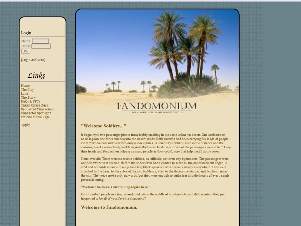
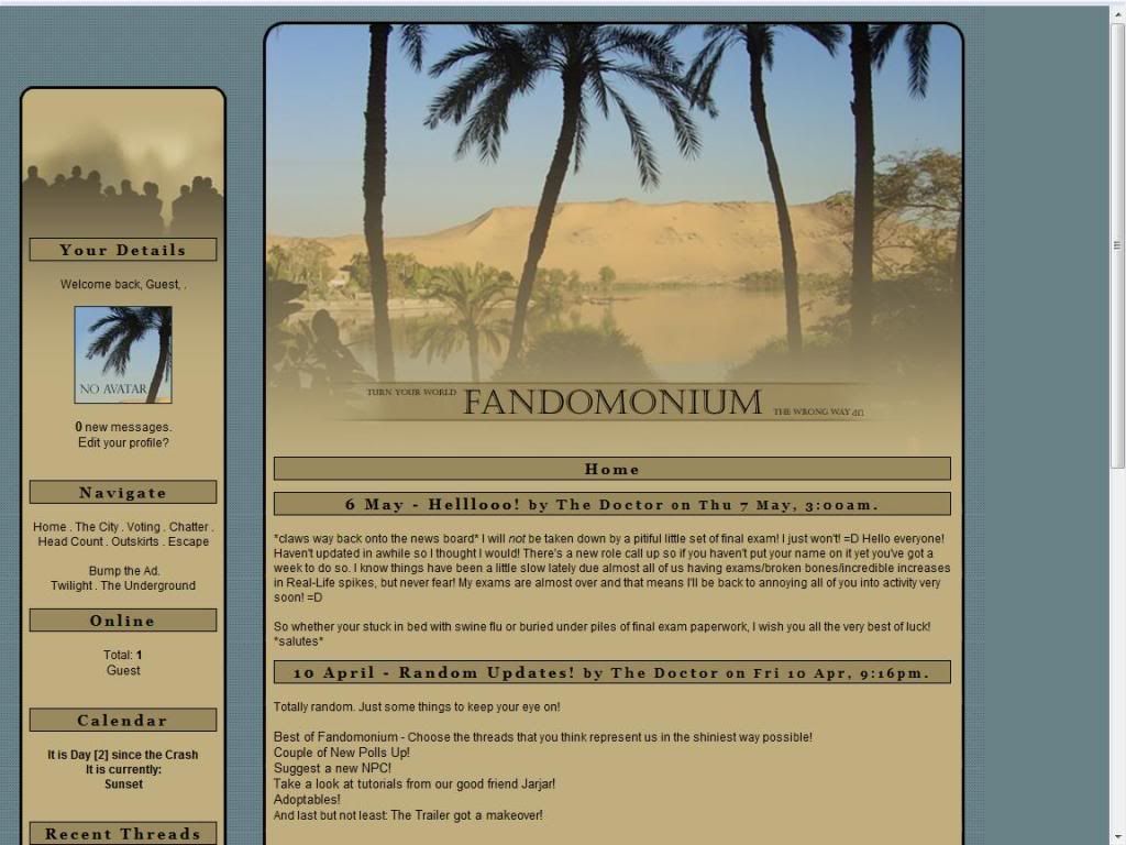
There's a lot of trees here for a desert.... Overall the layout is fine, since it's in the desert it keeps with the theme and everything is kept simple.

The Public Area:
The Index page is just a part of the AD and again I have no problem with it, so we move on to the next section!

The City page is fine one small thing though is that I would have liked to have the map pop up in a new window. Or get a script to show/hide the map on the same page.

The Rules page, and now we cross the first bridge. The rules themselves are divided into IC and OoC rules but this is the rule that's a problem. "Any powers that allow a player to escape or call for help will be stripped..." So lets go through the great Superman's powers shall we?

Flying - Taken away
Freeze Breath - Taken away
Super Strength - Taken away (Can swim/row quickly and escape)
Heat Vision - Taken away (Can signal planes or whatnot)
X-ray Vision - Keep it!
Telescopic Vision - Taken away (Can see people coming to signal them)
Super Speed - Taken away (Running across the water is escaping!)
Super Breath - Taken away (I'm sure if there were enough odd waves, cyclones, etc someone would notice)
Hypnosis - Taken away (Could suggest people use their collective abilities in a way to help him escape)
Cellular Absorption - Keep it!

So, the almighty Superman can only peep at people and absorb... stuff. (Another good example might be any of the Z-Warriors from DBZ, they use their life energy to fly and such... you going to take away their life before they even get there?)

FAQ & STC's -I'm not sure how the whole random event thing will work in this kind of RP... to me it doesn't make much sense to have it.

The rest of the pages I don't consider content, so we move onto the next section!

The Application:
Pretty much the standard, however the boxes to fill in things are small. They take up maybe 35% of the space that's available. ROLEPLAY SAMPLE REQUIRED.


The Private Area:
Layout is slightly different with images but more or less the same. I didn't see any private pages to look at but I do have a small comment. There are various links outside the side and I would have liked if they opened new windows also.

Jello's 2nd Rule: When links go to outside links they should be in new windows! (Maybe I should eventually list all of these one day...)

Forums:
Decent amount of forums and description, for this site I'm torn between the hotlink thing here. I'd put them in for aesthetic reasons and just because you have the option to freely extend the forums without any navigation problems in the future. But I suppose it's not really neccessary in this situation.

Other:
The Member list page is pretty much the standard nowadays, avatar and the basic info.

The Member profiles are generally filled out nicely as well.

Roleplaying:
From what I read on the forums I categorize the roleplaying on this site to be Intermediate.

Rating: 6.8 out of 10

Overall the site is good, however while TMoW has the whole anime thing, in Fandomonium you can get some really REALLY odd pairings. Like Juggernaut and say... Steve Urkel dueling to the death! While it seems amusing it would be rather odd in the long run. With that said its weakness is also the strong point so Fandomonium is a double-edged sword and how its run will sway it one way or the other.


Reviewed by: The Jello Emperor

Penumbra [8.0/10]

|


Greetings on this Tuesday! I hope you all had a great Memorial Day and all that good stuff but lets all settle back down now from the 4-day weekend and get your nose back down and sniffing the scent of a new review! (I tried to get a wolf reference in here, didn't work so well.)

Anyway, the site I'm reviewing today is called Penumbra a wolf RP! The AD for the site gives a decent backstory on why said wolves are on an island and why no human interference is there. Near the end of the AD I saw some things that interested me and I'll be ready to pounce on. (pounce is more of a feline word isn't it? ...FOILED AGAIN!)

Noses to the ground now people and get ready for the hunt, for the review!

Quick shout out to Tess my loyal follower on Twitter, Jell-O Points for you and Penumbra!

First Impression:
147, 148, 149, 150 paces! "X" marks the spot! Layout is nice and I like all the colors, and the random people I talked to on the Cbox were friendly. (Or maybe I'm just that influential that people just want to be nice to me... HAH! We all have a good laugh there?)

The Content:
Live Chatroom - I was in there for a while and no one was using it so, I see no reason to have it there. Plus you have an auto-refreshing Cbox. (Note: This was my mistake I had overlooked what its intended use was!)

Avatar List - No real comment here, I just found it amusing that the artist who will take upon drawing the looks of your wolf is named Vanity.

Inhabitants - Very nice.

Seasons - Overall nice, however if there is any seasonal differences with pups in terms of elemental affinity, (Like winter pups normally bring about fluffy wolves manifesting snowballs or things like that) or if fighting is more difficult in certain seasons for certain elements it's not explained here.

Event Calendar - Just would like to see here some maybe more styling, bold things here and there (or increase font size a smidgen) because there is quite a bit of text.

Element Specific Pages (General) - On the skill trees, for the 3rd tier, all the moves are connected. So from what I understand all the final moves are interconnected even if you chose a different path at the start? If this is so then that's something I have a problem with, it's akin to saying that since I've specialized as a kidney surgeon, brain surgery is just a walk in the park because it's all medical right?

(Side Note: I personally would go for these blessings;
Zephyr: Speed -> Agility -> Teleport -> Invisibility .
Because I'm sneaky like that, and start a renowned wolf pack of super spies!)

Fight System - Overall fine, it's not my favorite type of system but it works.

Abilities Guide - Overall fine, just a small thing to point out here. Under "The Ability Listings" section, first sentence: "If you look to your right, ..."

Rules Page - Split into various sections, overall fine no real problems here.

Packs Pages all look nice, though I don't understand why "PoW" is used for those who are in the pack but are shunned for the Embers. Maybe "court martial" or something would be a better term?

The Application:
Nice and simple here, NO ROLEPLAY SAMPLE REQUIRED!

Forums:
Good amount of forums and descriptions for each, along with hotlinks! Also I like the whole map thing, much more convenient that a separate page of its own. However, some of the actual posts though the text is a bit too narrow for me. Seems like a newspaper column and uses like 40% of the width given.

Other:
Member list is nice showing quite a bit of info in a small space, plus there's the personalized wolf avatar...thing!

Member profiles are organized well and are generally filled out nicely.

Roleplaying:
From what I read on the forums I categorize the roleplaying on this site to be Intermediate to Advanced.

Rating: 8.0 out of 10 Points

Overall the site looks very nice, and polished. Obviously a great wolf RP but I personally am still looking for the next leap in this genre. Just an overall comment here I did catch some language on the info pages and since the whole site is viewable it should be parental friendly. Such is the burden of having a public site, and having a right wing, church boy reviewing it.

This Site has the Jello Seal of Approval

Reviewed by: The Jello Emperor

Happy B-Day Jello Emperor!

|

Today (May 23rd) is a great monumental day! The day in which The Jello Emperor was brought into this world. I also share this wonderful achievement with greats like Ken Jennings (The Jeopardy Genius), Jewel (Is there another person whom I can connect with the female crowd with?) and Drew Carey (Current Host of The Price is Right).

So feel free to give me your well wishes in the comments. =P

Update: I'm thinking about writing another blog about just random rants and things but I don't think people care about me enough to warrant such a thing. (Evidence is already apparent in the comments section....)

Greystone [5.7/10]

|


http://www.acornrack.com/greystone/


I have to say that Thursday keeps creeping on me fast! But anyway it's that time again so today I'm looking at a City RP called Greystone!

So the AD, personally I don't really care much for the first half no amount of description is really going to sway anyone from not joining. So what really matters in my opinion is the second part, being a relatively simple RP. Overall though it's fine City RP's are generally harder to make ADs for anyway though the text is a bit small. But lets move on towards the review!

First Impression:
Reminds me of like a postcard of some sort. Anyway the first thing I noticed was the mass area of negative space. I'd like to see like the first part of the AD maybe posted here on the main page to get rid of aforementioned negative space.

The Public Area:
The Rules page is fine, but maybe space out the rules a bit more to get rid of negative space.

The History page is fine, the story is overall decent and gives a little bit of character to the RP. Perhaps this might be something to built upon in the AD as well.

The Application:
The application so far is the most complicated part of the site, and it's your normal application. ROLEPLAY SAMPLE REQUIRED.


The Private Area:
Layout Chaaange! This private layout gets rid of all the negative space issues and is overall nice. The rest of the pages are unviewable by the guest account so I'll have to move on to the next section.

Forums:
Good amount of forums and descriptions, however the size of the forums is a bit small so maybe extend the table to maybe 70%. Also the use of hotlinks to the separate sections would be nice to curb navigation time. The text in the topic listing is a bit small though.

Other:
Member list gives you an avatar, rank, and a sentence of info. The Member profiles though are much more complex, various pictures and organized well and are generally filled out nicely.

Roleplaying:
From what I read on the forums I categorize the roleplaying on this site to be Intermediate to Advanced.

Rating: 5.7/10

Generally when I review simple oriented sites like this I tend to try to expand my thought processes a bit more and maybe explain reasons why I want a certain word here for like a paragraph to extend the length of the review a bit. (Sort of like how I'm just rambling on right here!)

With this site however I couldn't really do that just because of the type of RP and what I was able to access. So my apologies for the short review but I can't review what I can't see. With that said, it overall looked fine and I didn't really have any problems with the site in general.

Reviewed by: The Jello Emperor

Isilme [8.5/10]

|


http://isilme.acornrack.com/


Another Tuesday and it's time for another review! Today I'll be reviewing a site called Isilme, and just for those who actually check the AD and such often I had it written down as "Islime" for a few days before I realized it. One of my random thoughts wondering why a horse RP would be called "I Slime" ... but I suppose that's a story you'd rather I'd not tell.

While I'm not exactly the the biggest fan of horse RP's and the like I actually found the AD very intriguing. It has a nice backstory and it's written well enough to interest even someone like me. (That's intended as a compliment, though it may not really sound like it... )

Anyway, blink and nod or twitch that nose of yours to magically move out of the way before I SLIME YOU! (I Dream of Jeannie and Bewitched references, High five!)

First Impression:
For some reason that picture makes me think of The Neverending Story, except there is a flying horse instead of a flying dragon. The green color scheme is half and half for me, I don't mind the dark green background but the lighter green in the center is not my cup of tea.

The Public Area:
The Index page has some of the text transplanted from the AD, which works fine for me. There is also a bit of music and the only thing I have about music is that I really prefer them to not be on autoplay because some people may not be in a music friendly environment (Like a library or supposed to be working...) or slower connections and would hinder their experience.

The Rules page, has quite a bit of writing although the larger portion are guidelines. But even though you only have to read the rules to join, I will stampede through the text and give my comments! (Extra points for using a "horse-y word?") I really only have one comment on rule 3, I think the word count your aiming for is too low. But I don't have experience in these types of RPs so I don't know if that would make it too difficult for admins to enforce or whatever.

On Challenging Guideline 1: You say you have a point system rubric, but since it's based on writing I'm not sure how it would work in terms of fairness. So I guess my general comment is be careful with the system. I'm personally interested on how the system works, since I create new battle systems for every RP I create.

On Invasions: I'd like to see a more detailed example in the forums on how this works. (I've not seen the forums at this point if there is one in there)

On Stealth: I like this idea, it's very interesting!

I'm generally against cursing in the rules page even though you've established this as a more mature RP. This is the public area where you are still responsible for content, save the language for private area.

On Breeding #7: You state stats are settled with random dice, and I'd like to offer an idea for you to ponder. While those foals are born in different seasons, perhaps the chance of being born healthy weighs the risk of a strong offspring like such. Foal A is born in spring and gets a combat stat of: 3. Foal B is born in winter (and remains healthy) and due to harsh conditions Foal B is more suited for battle and gains +2 to combat stats due to weather conditioning. Different seasons could yield different bonuses to help the herd.

On Dragons: I'm not a huge fan of this idea although I understand the need to level the magic playing field with Equines. It all seems a bit too Eragon-y to me though.

Finally, you have hotlinks down to sections but none that go back up. My general rule is what goes down must come up! I call it the Law of Resonant Hotlinks! Okay, not really but it IS my general rule...

The FAQ Page, overall fine the item page links to the AR1 site so that should be replaced with a more current link. Also I'd also suggest to make the links in this area target separate windows for convenience for the YouTube links or those external to the site.

The Application:
Your standard application, NO ROLEPLAY SAMPLE REQUIRED.


The Private Area:
Layout Change! More or less though it's just a navigation bar extension so, don't fret!

Herd pages are overall nicely formatted and looks neat.

Another small comment, since you are an AD driven site you can afford to post private layout oriented rules and FAQ pages. By that I mean simply make a new rules page with the header, footer blocks for the private layout.

History is fine, perhaps some neater formatting would be nice though.

Adoptables and Affilates are self-explanitory. No comments here.

Contact page is fine, would like to see which characters are played by the admins though. Makes it easier for guests to pop in and ask things on the cbox/tagboard for clarification on things.

Items, Magic, Record, Magic in Battle and God Titles page link is not viewable to the guest account.

Points pages are fine for their purpose.

Forums:
Good amount of forums and description. No hotlinks but I think here is a rare balance of forums and space taken up that works without them.

Other:
Memberlist is a basic listing of users by userlevel, the profiles are generally filled out well and are organized fine.

Roleplaying:
From what I read on the forums, I categorize the roleplaying on this site to be Intermediate to Advanced.

Rating: 8.5 out of 10 Points.

To be perfectly honest I wasn't thrilled to review a horse RP, however this site has given me some hope for the genre! The site is executed very well in my opinion and is something other should try to emulate. Small improvements here and there can be made but other than that I have not much else to say.

Final Note: I'll record myself trying to speak Swedish for that contest thingy as a Dark Horse entrant! (Get it!?! Dark Horse!?!? Horses... and the RP... Oh and I'm serious, I'll be in contact with the admin probably with my entry.)

Here is my entry!


Or you can download the file here:
http://www.fileden.com/files/2008/3/8/1803698/JelloSwede.mp3


This Site has the Jello Seal of Approval

Reviewed by: The Jello Emperor

Sunny High [5.5/10]

|


http://www.acornrack.com/sunnyhs/


As we near towards summer vacation for all you people still in high school and such, we'll take our sights to a school that never closes for the summer! (Well maybe it does IC, I haven't actually looked at this point...) Anyway, the site I'm reviewing is Sunny High!

The AD is somewhat odd in the way that there is no "real AD." Rather it's basically an inviting sentence or two. For sites that are more reality based, (City, School, etc) these type of things actually work well. Alright everybody, grab your plate because these eggs are ready just like you ordered, Sunny High up! (Egg jokes are always full of win!)

First Impression:
The football picture reminds me of the movie Facing the Giants. Anyway, the layout is centered and the colors look fine to me. There is however a few nitpicks I have right off the start. First I'm not all that big a fan of the image overlapping the links. Second, I have no idea where the links start and end so I'd like maybe more obvious separation between them.

The Public Area:
The index page has the default text when you create a site so I'd like to see that changed maybe some sort of minor introduction.

The Rules page to me looks unfinished, the rules aren't separated clearly enough in my opinion and I think maybe rewriting the rules to be a little more formal would be nice.

The Sunny High page is just the reposting of what is found in the AD more or less.

The Application:
The application is rather short, not requiring character descriptions and what not. The trade off on the easier application is the quality of RPers sometimes suffers though, so I guess you pick your poison. NO ROLEPLAY SAMPLE REQUIRED.

(Hey! If you look closely in the image or view it directly you can see that I'm mentioned! Yay me! *cough*)


The Private Area:

Layout extension with the addition of the cbox and recent threads portion. I still have my nitpick about wanting links to be more obviously separated and look neater. If you notice though in the picture you see the scroll bar for left and right movement. That may be something to look into after other things are finished.

Otherwise I cannot comment on the rest of the areas of the site because I don't have access to them. However, I've seen enough RPs like this to know what SHOULD be on those pages.

Forums:
There is quite a bit of forums here and again it's time to play the old record, I highly advocate the use of hotlinks to allow for easy navigation especially with a large amount of forums. It may be difficult to do this without clashing with the links at the top but it is definitely worth having them.

Other:
Member list has the avatar and little bits of info on the character as always.

Profiles are organized fine and are generally filled out well.

Roleplaying:
From what I read on the forums I categorize the roleplaying on this site to be Intermediate to High Intermediate.

Rating: 5.5 out of 10 Points.

Overall the site is slightly better than average but I don't really see anything that makes it stand out from the crowd. Some parts of the site seem incomplete and other parts just need more work in general. Probably good for the more casual RPer.

Reviewed by: The Jello Emperor

Macabre [8.7/10]

|


http://macabre.acornrack.com/


Today on this Tuesday we're going once again into the depths of the darkness... More vampires, werewolves and slaves, Oh my! Welcome to the world of Macabre, were evil isn't isolated in a defined location but spread through the world taking your Popes!

Since it seems important for the site, perhaps would be a good time to know what macabre means. Yes, it is actually a real world so I'll wait here for you while you go off and search for the definition.

...

Back yet? Fine, if you're too lazy to do it click this link here: http://tinyurl.com/oqu4hr
(I promise it isn't one of those stupid scare things.)

...

Alrighty, know what it means now? Good! Lets move on to a short blurb about the AD! The AD is organized well and the concept and story for the site is interesting, that's more or less all I have to say about the AD. So moving on!

First Impression:
Ol' man statue, dat ol' man statue... The colors for the site are fine but already theres a little nitpick I have, more than half the site is on the bottom half of the page. Hopefully the site scales, because if my resolution was smaller the site would need like 5 or 6 complete wheel turns to see everything.

The Content:
The home page has the same info as in the AD, but no problems with that. So moving on.

I would like to point out at this point the navigation system for the site is very confusing. So I'm going to take a few minutes and figure everything out. (Okay, above Cbox = members. Below = generally non-member stuffs)

The History page is fine, it's written well and interesting if you're into the whole religion twisting thing. Onwards to the next section...

The Dark council page is fine, only one small comment... there's a grammar error. "There were too man Dark on Dark fighting..."

The Dark Court page explains how the government is set up between the races and it contains their ideals or positions on slavery, territorial boundaries and how they choose whom are rulers. Perhaps a separate title for the "ideals" section or else it's misleading. In the Devil section there is talk about a threat coming from the motherboard...

The Papacy page is fine, no problems.

The World page is more or less fine, again no problems. Just a small comment, there is comparison between the Americas and Europe but I don't remember Europe's condition really being explained. So I really have no real idea how the dynamic of the world is.

The Humans page is fine, no problems.

The Werewolves page is generally fine, though here I do have a nitpick. Mostly the werewolves shape shifting, thing. Trying to break the mold on werewolves in my opinion doesn't work, ever, especially with shapeshifting. While my definition of werewolf allows for it, (A being suffering from Lycanthropy) saying every werewolf can have abilities outside the Lycanthropy affliction doesn't work for me.

(Grammar Error: Sigmund, the 3nd ...)

The Vampires page is overall fine, vampires having telepathy is new for me but I'm not much of a vampire person so whatever.

(Spelling Error: ... "drawl" to virgins... )

The Devils page is overall fine, coding error in the images section though.

The Halfbreed page, aside from simplifying genetics to a 2 piece puzzle, I have no problems. Generally it seems like Halfbreeds get the short end of the stick... just as a general comment as well.

Fighting Page, I don't quite understand the reason for the asterisked comment, something about apostrophe referring to items or something... Next I was under the impression that generally a new moon is devoid of light considering there is no sun to reflect light off of it. So saying the phrase "light under the new moon" is a bit odd. In the Vampire portion there is no need for the comma after despite, otherwise no problems.

No problems on the Turning page.

Love page is overall fine aside from (again) turning genetics into a 2 piece puzzle.

Misc page, first it's "double edged sword" not double edge sword. Second, the currency system is confusing me. You say "Gold: 100" but 100 what? Is it based off of Tin? (Yes if you read the chart it IS based off of Tin, but as I have little faith in peoples intelligence it might be useful to write it down.)

Ranks page, generally everything is fine except for one thing. All comparisons are made to humans, but it would be beneficial to define what an "average human" can do. For instance you say this rank is 4x as fast as a human is this Usain Bolt fast or Fat Albert fast?

Laws page, grammatical error when listing the punishment for slave thieves. Spelling error in the last sentence of first paragraph, "forfeit." Otherwise the rest is fine.

Research page is fine, except for the lack of information for Important Darks and Angels.

FAQ page is generally fine, number 6 should probably be more like 5b though.

The Rules pages is overall fine, lots of writing but I've come this far so might as well continue. 3lite? It's called leet (1337) speak! (1337 5p34k FTW!) Also, just pointing out the term hentai is a rather exclusive term. "Any pornographic pictures" would be a better phrase. Again listing grammar is incorrect. (A LOCK)

Adoptables is self explanitory.

The Application:
You get a little thing in before the application like a guide of sorts and I have a nitpick about it. In the rules page you say you prefer people to not be prudes yet you say you're one, so that kind of clashes in the overall picture.

The application itself is standard fare, ROLEPLAY SAMPLE REQUIRED!

Forums:
The forums are split up over 5 areas, 4 under the cities navigation the other in the basic forums link in the basic navigation. Aside from the basic forums link being out of the way everything is fine here. Good amount of forums and descriptions for the cities and quite a bit in the OOC forum area.

Other:
Member list is fine, nothing too special here but I'm not really looking for it either.

The Profiles are generally filled out well and *points at Erik Shin's picture* Jaejoong! n_n ... *cough* ... are organized fine. (Hey I know my Tohoshinki/DBSK members!)

An interesting thing is when you log in under your "HUD" you get 4 quicklinks which I assume you can set in your profile, a nice little innovation there.

Roleplaying:
From what I read on the forums on the site I categorize the roleplaying on this site to be Advanced.

Rating: 8.7 out of 10 Points.

Overall very nice, there is really quite a bit of text to read so if there is a way to shorten it and keep the same quality it would do wonders. The main problem I have is that all these pages extend the page so perhaps if you could expand and shorten the menu with Javascript to avoid having people scroll down so much for certain pages..

This Site has the Jello Seal of Approval!

Reviewed by: The Jello Emperor

Blood Lust v2 [8.7/10]

|


http://www.acornrack.com/Blood_Lust/


Welcome denizens of the night to the review of this Thursday! The site I will be reviewing (or rather, re-reviewing) is Blood Lust. This is a dark, modern, vampire, lycan RP and with the assortment of random humans in there.

The AD for the site is kind of weird, the colors clash with the AR2 site so it makes it slightly harder to read. The story part of it I didn't really understand so much, how it tied into the site and what it's importance was.

In any case eat your cloves of garlic, arm yourself with a silver sword and press onwards towards the DVR to watch a rerun of The View! (Re-View ... get it? ....)

First Impression:
I think she likes me! No problems with the layout and the colors are fine as they attribute to the blood and dark nature of the site.

The Public Area:
The home page has a little blurb about the setting, no problems here.

The Rules (Laws) page is organized into 3 sections. Overall it's written very nice and I have no problems. And the problems I had before are fixed now so.. yay for them!

The Races page, lots of text and information here and obviously the Vampires and Lycans have more detail because we know what humans are like.... I think. But I really have no problems with anything on this page. If there was anything I'd nitpick at it would be that there really is quite a bit of text to read but since it's all detail, this is not so much of a problem.

The Pravus page has everything and anything you need to know about Pravus, it's districts and things like that. Everything is well written and I have no problems with it.

The Adoptables page is self explanitory.

The Application:
More or less your standard fare, however the red text on red background is difficult to read. ROLEPLAY SAMPLE REQUIRED.


The Private Area:
I'll just copy/paste from the old review since my feelings are the same at this point, I think the image at the top is different but I can't be for certain because I have a bad memory and no pictures!

"The layout is also very nice and everything has its own little place. I have no complaints, all the links are nicely organized and any clutter is taken care of because of the links across the top of the page."
Forums:
Good amount of forums and descriptions, use of hotlinks is good for easier navigation. No major problems here.

Other:
The Member list page looks nice, each member gets like a little card. This holds the avatar and other bits of info, overall nice.

(Side Note: For all you city RPs out there, if you superimpose an avatar picture to be on top of a "driver's license" I think it would be neat for the members list.)

Member profiles are generally nicely filled out and are organized fine. No problems here.

Roleplaying:
From what I've read on the forums I categorize the level of this site to be Intermediate to Advanced, leaning more on the Advanced side.

Rating: 8.7 out of 10 Points.
Overall Change: +0.2 Points.

With the new and improved version the points are bumped up slightly for fixing various errors and updating a few things. Overall very nice.

The Site has the Jello Seal of Approval!

Reviewed by: The Jello Emperor

New York: Hell's Kitchen [7.0/10]

|


http://www.acornrack.com/NewYorkHK/


This week we take a look on the darker side of things... No I'm not talking about Star Wars and The Force! This RP is a city RP with gangs, the mafia and other things that go bump in the night. The site I shall be reviewing is called New York: Hell's Kitchen , obviously set in New York!

The AD for the site is short and sweet and for some reason I think about Yu-Gi-OH! I'll play my cards right though and just stick to the AD for now, as I said though the AD covers the basics of the site and I have no real problems with it.

Anyway, grab your frying pan and cooking utensils and LEARN TO MAKE SPAGHETTI TO ORDER AND SOME -bleep-ING RISOTTO! ...Ahh wait, wrong Hell's Kitchen... but feel free learn how to make risotto and send it to me anyway.

(40 Minutes Later with a Hell's Kitchen Episode watched...)

First Impression:
Where the heck is Gordon Ramsay!?! *cough* I mean, Yay for Statue of Liberty! I have no major problems with the layout, the monochrome is a bit dull, but I understand the reasons for it with the site setting being a dark city RP. So again, no major problems.

The Content:
The main page has a small blurb about the site, this is different than the AD but has the same feel. No problems.

The Rules page, everything is explained nicely enough. I have no problems with this page... though I did have to google what a "scene kid" was...

The Gangs page, will have all the information for the different gangs on the site. I say "will" because at this time there either are no gangs or it hasn't been updated into that page yet.

The Adoptables page is self-explanitory, however I'm not a fan of the smaller text overlapping the large ones. And, I want Frodo as my accountant. >_>

FAQ page is also self-explanitory. No fun comments from me though. Post-scripts ARE ALLOWED.


The Application:
The application is standard fare, ROLEPLAY SAMPLE REQUIRED. Took me a second to figure out that NYFD was the Fire Department in the affiliations portion.

Forums:
Good amount of forums and descriptions here, and they use hotlinks for easier navigation. I have no major problems about the forums. (I think that may be the first time I've said that...)

Other:
The memberlist has little target cursors over the avatars of the individuals of the site which I thought was neat.

The profiles pop out into a separate page which is nice since it doesn't give the restrictions of the site layout. The profiles themselves are generally filled out nicely, and I also like that most of the member that I saw used "heterosexual" instead of "straight". One of my weird quirks I guess at work here...

Roleplaying:
From what I read on the forums I categorize the roleplaying on this site to be Intermediate. Some of the posts are formatted oddly in my opinion, so sometimes the reading was difficult.

Rating: 7.0 out of 10 Points.

Overall the site was okay, nothing as a whole struck to me as original or anything so that's the reason for the rating. The site is executed fine and I have no real problems.


Reviewed by: The Jello Emperor