Equinex: School of Horsemanship [7.0/10]

|


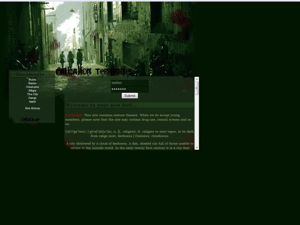
http://equinex.acornrack.com/


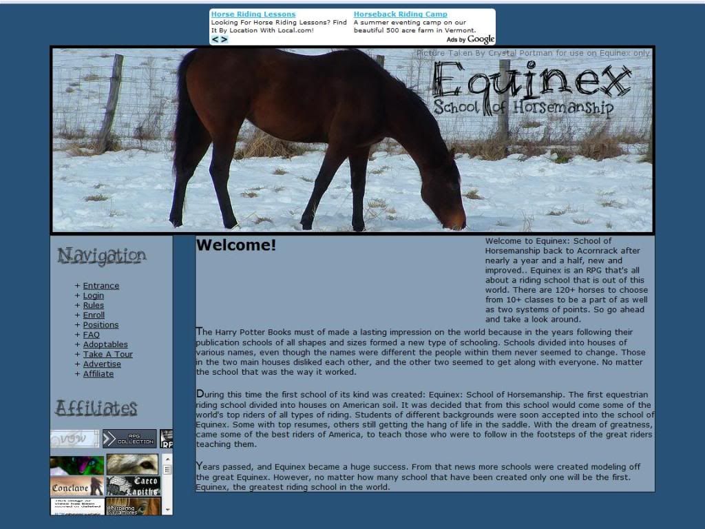
This next site I'm reviewing is an Equestrian RP, not horse, but you a person are joining an equestrian riding school. Not only a equestrian riding school but THE school the best of the best school where those from around the world only dream of attending.

The AD gives you a bit of background on what the site is and how the actually school came to be and the mixing of a real world event with a bit of fiction to blur the lines. Now all you equestrians out there grab your gear, saddle up and lets gallop onto the review!
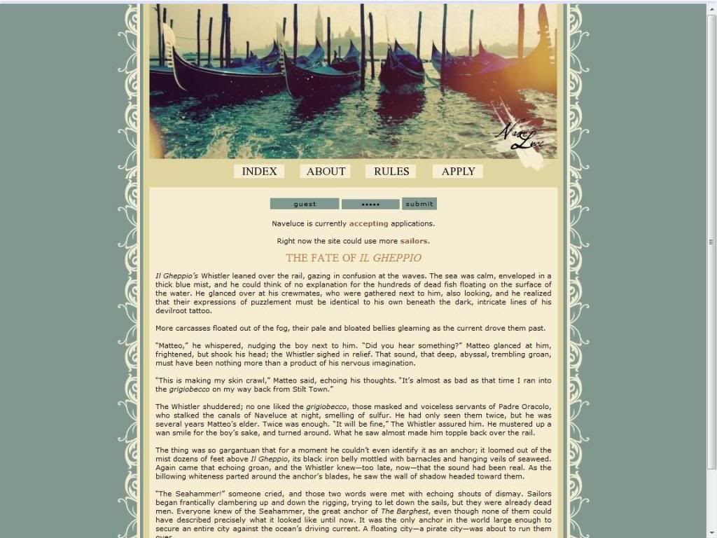
First Impression:
Lots of Affiliates... I have no major problems with the layout, however the "welcome" text with the large blank spot surrounding it looks a bit odd. Again this isn't really major.

The Public Area:
The Front page is more or less the rewriting of the AD aside from the cold cut section dividers which is fine.

The Rules page is where I have my first nitpick, I've never heard of it referred to as "Godmocking" but rather Godmoding. Other than that small thing the rules are well written out and define everything fine.

(Spelling/Grammar Errors: "...have a copyright on the picture if it doesn't will will asume that the image is copyright free.", "asume" should be "assume" and there's a grammar in that same sentence also signified in italics. Very last sentence on the rules page, "delected" should be "deleted".)

Positions page is more or less a list of the ranks, student and teacher positions and the like. However a few nitpicks here, striking out whole things of text isn't the best way to indicate something is taken. I still want to be able to read what they do without too much difficulty. Also, I would have liked more creativity on the house names. Since it's a horse RP why not just do horse names, I'm sure there are horse personalities that match up for each of the descriptions.

(Spelling/Grammar Errors: "striked" is not a word, stricken, or struck out would be the past tense you are looking for. "English Pleasure Instuctor" also in that same area "english" should be captalized. "incharge" is two words, this appears multiple times in the page. The Eventing Instructor has "inchange" instead of "in charge", "This is to based off of USDF regulations to some degree, another country's regulations is fine but, those basic gists, not the Eventing dressage regulations." this whole sentence needs to be reworded and "gists" is not a word, "gist" however is. "endurance" is spelled wrong in the endurance instructor area.)

The Application:
The standard application, I would have liked to see simple drop down menus for the houses, rank and gender area.
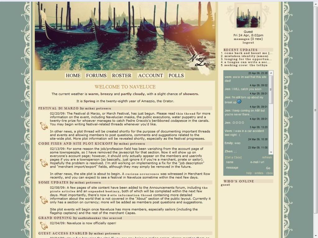
The Private Area:
Again, I have no problem wit the layout because it is generally the same as the public one. There is however the addition of the cbox and word count script in the bottom left.

(Spelling Error: "Calendar" is spelled wrong in the link.)

Teacher's Handbook, under the heads of houses rules I don't understand why rule number 8 is there. If this is the teachers handbook then it should be implied that you'd have to be a teacher to apply for said position. Otherwise the page is fine.

Student's Handbook, under the horse rules you explain that a student and instructor is allowed to have only 2 horses. Since this is the student handbook the information for instructors has no use here in my opinion.

(Grammar Error: Student Handbook, selecting a horse, first sentence, "a equestrian" should be "an equestrian")

The House pages are all generally listings of the members and a short description of the characteristics of the house.

The Horses is where the site starts to shine, there is quite a bit of detail on which kind of horses there are and pictures of each of them with a short description. I personally only read through a few pages, but the ones that I read were all organized nicely.

The Shows page is also generally a listing of what is required for each show, I really don't know much about horse shows so I assume all of it is written out correctly. I would liked perhaps better separation between them and perhaps a bit more style involved instead of just the "grocery list" of what is what.

H. Point Shop, or is it the Horse Point Center... one of the things will have to be changed. This page along with the other pages linking off from this page are generally listings or explanations of things. Overall no problems.

Forums:
Good amount of forums with nice descriptions also there are picture that correspond to the forum you are in which is also nice. I would have liked to see a few things here though, first of all more separation between the OOC and IC areas. I was having a hard time trying to see where one section ended and one began. Also, I'm a fan of hotlinks to each section if you don't use forum separation code. So the other think I would have liked to see is that, hotlinks down to the IC sections and subsequent "to top" links.

As for the posts I also would have liked to see a bit more separation at some points I wasn't sure where the posts ended for some members and it confused me at times when trying to read the forums. Also, the default text size was a bit large for me.

Other:
Member profiles and the listing was not available to be seen, so I cannot comment on things in there.

Roleplaying:
From what I read on the site I categorize the majority roleplaying to be Intermediate. However there are people who can clearly roleplay in the advanced area.

Rating: 7.0 out of 10 Points

While the horses page was very nice everything else didn't seem to have the polish that I was looking for. Lists and lists instead of more in depth writing and explanations, or more aesthetically pleasing pages that could make reading them easier. The Forums also were a rough patch as well, so that should be taken a look at.


Reviewed by: The Jello Emperor

Naveluce [9.0/10]

|


http://www.acornrack.com/Naveluce/


The next site on the list will sure give you a reason for your ship to set sail because it's a Pirate RP! Okay, I suppose it's REALLY "nautical" and "fantasy" RP but I like pirates so... yarr... but anyway the site that I'm reviewing today is called Naveluce!

The AD of course is well written, especially because there is the mention of a floating pirate city! I suppose a reliable mail service would be difficult and whomever got that route really drew the short straw. Don your eye-patch mateys, turn the wheel hard to starboard and head straight onto the second star until morning! (Ahh, wait that was Peter Pan....)

First Impression:
Gondoliers, on my signal commence invasion! I have no major problems with the layout, although the picture edging the top of my window sometimes makes me think I'm not scrolled up all the way.

The Public Area:
The Front page is essentially the bulk of the AD but it's written well enough that I don't mind it, (Floating Pirate City... remember?) and it gets you into a chantey mood.

The About Page, is basically everything and anything you need to know. Descriptions of the nationalities, pirates, ship crews, professions.. it's all here! Of course there are hotlinks to each individual section if you want to read individual parts and the "return to top" links as well. Just wanted to point on the amount of detail that the site goes through to create the feel and the world of the site as a whole. I myself didn't realize how finely detailed and well thought out the whole thing was.

The best way I can describe it is like a Documentary film, you see everything and you go "Well yeah that makes perfect sense that's how it's supposed to be!" But it was specifically created that way that perfectly, you didn't even realize it was an imitation. (Something like that...)

The Rules page is well written out and I have no problems with it. There is also an FAQ on the bottom which is also to my liking.

The Application:
The application is very neatly set out for the user, with certain choices needing to be filled for each specific rank. But overall it's the standard.


The Private Area:
Layout... extension! That would be the more appropriate term, generally everything is within initial screen load so overall it is nice. I see no link back to the public area of the site however.

Look at that no private pages! Although as it said in the About page, there is details on the jobs on the ship in the forums.

Forums:
There isn't too many forums but each individual forum encompasses a large area so it cuts down on the need for them. Nice descriptions on each of the forums and it overall looks nice. The posts are formatted nicely also, giving the site a distinct flair.

Other:
The Member list, now brace yourself because I think this is actually the first nitpick I have about the site! It's essentially a listing of course of the members but I would have liked to seen perhaps a sort of organization to them. Like divided into the Good, Bad and Neutral or something so it's not "just there."

Member profiles are generally nicely filled out, while there is sometimes a bit of information the scrolling of the page actually works with the theme of the site. It's like reading a work of a scribe or something like that.

Roleplaying:
From what I read on the forums I categorize the roleplaying to be Intermediate to Advanced.

Rating: 9.0 out of 10 Points.

Overall the site was nice, I had nothing really major against the site as a whole. Everything was written and organized out neatly. This sort of site isn't my cup of tea, but if you really like the era of pirates and 18th century things and that culture this will be a great site for you to join. At this point I see no major plot involvement but other than that this is something you have to really look into yourself to get the full feel.


This Site has the Jello Seal of Approval!


Reviewed by: The Jello Emperor

The Wolves of Joukai [8.0/10]

|


http://joukai.acornrack.com/


Time to start the work week with a review of this RP: The Wolves of Joukai. For those who haven't caught on already, this is a Wolf RP but more specifically a realistic Wolf RP. And for those who aren't sure what Joukai means I'll tell you that as well! Seeing as "joukai" has multiple meanings depending on kanji I've listed them below (My apologies to those who do not have the Japanese font as this probably will be full of kanji):

常会 - (n) (1) regular meeting; (2) ordinary Diet session
上界 - (n) (1) upper world; heaven; superkingdom; (2) {in math} upper bound
浄界 - (n) sacred ground; the Pure Land

Many obviously would choose "sacred ground" or "heaven" even, but because I find it amusing I'm going with the "ordinary Diet session." (Note: Sarcasm... maybe)

The AD itself is very nicely written out, with images to liven up the AD a bit as well. And of course I like having the contact information for the admins on the bottom of the AD it makes it easier for me to annoy and get on their nerves offer small tidbits of advice before the review. Anyway, grab that Slim-Fast® and get ready to power walk onto the review!

First Impression (第一印象):
Paw print, Check. Welcome to... Mozilla Firefox, or http://joukai.acornrack.com/ ! The point I'm trying to get across here is that the site has no title code, so that's the first nitpick of the site. The layout is quite nice and is all a very nice image map. Also the image at the top changes depending on which page you are at, I've decided to follow this trend and use my own kanji for this review.

The Public Area (共用部分):
The Front page is the AD's story written again but shorter, I'm not sure if this is intentional or not but the reason I have for it intrigues me. I'll have to ask about this particular reason personally.

The Rules (概則) page, is nicely written out and divided into OOC rules and IC rules but I have a small, nitpick here. In the "In Character Rules", the last rule is to "Have Fun!" This is more of an OOC rule.

The Application (志願書):
While initally at first I thought this was a normal application... the more I looked at the more it actually confused me. First, there are two RP sample to be filled out. Second, in the first sample request... I'm really not sure what I'd write in it even though it says something about appearance and personality. Third, the second sample request they say "quality over quantity" yet in the first one they want "a paragraph or two."


The Private Area (試写):
Layout Change! Subtle though, there is the addition of other general things wolf sites seem to always have (Moon phase, season, etc.) I personally would have liked to see who's online in the initial screen load instead of the lower left. Also, perhaps inserting commas to separate peoples names a bit in the who's online section would be nice. Also maybe have the text links remain the same color after being clicked.

I was only able to see two of the private pages but I'll shall comment on them anyway!

The Map (地図) page is a map! Not really much to say here because it's a drawing of map, a nicely drawn map...

IC Rules (キャラの概則) page, is basically an expansion of the public IC rules in addition to some things that are purely in site things, like claiming territory, fighting, and things of that nature.

Forums (電子掲示板):
Good amount of forums with nice descriptions for each, there are hotlinks to the IC and OOC sections. I expect there to be more divisions when packs have claimed certain areas but there are no links to go "Back to the Top." Again I'll preach my rule- If you have links down, you should have links up.

Other (雑事):
The Member List (会員名簿) looks neat and admins are identified with colors instead of marks before or after their user rank.

Member profiles (ユーザープロフィール) are filled out quite nicely with their information I would have liked to see perhaps a hotlink to the OOC information since it's sometimes a few scrolls away. It's nice to see that quite a few members have pictures of themselves on the site especially the admins, gives a sense of knowing them more and a better sense of community. (And I think they're rather cute, so yay for... actually I'm not sure whom this is better for.)

(Side Note to Admins: I'm 21 years old, like taking long walks on the beach while looking at a beautiful sunset, and am ready for a commitment. I'm also an animal rights activist and adore wolves.... This is also an attempt at humor if you didn't catch on.)

Roleplaying (能文):
From what I read on the forums most of the roleplaying on the site can be categorized at Intermediate to Advanced.

Rating (格付け): 8.0 out of 10 Points

Overall I like this particular site, it's a simple wolf roleplay and it seems to work well. While wolf RP's aren't exactly my thing something simple like this might be something I might try in the near future as a change of pace.


This Site has the Jello Seal of Approval!

Reviewed by: The Jello Emperor

Caligation Territories [8.5/10]

|


http://www.acornrack.com/ct/


Today I'll be reviewing a site called, Caligation Territories. This is a Dark, City RP with a dash of fantasy and gangs for the additional fun. I suppose it would be foolish of me not to include a warning at this point that this site contains MATURE THEMES and is rated for M for MATURE!! (That's Mah-toore! Fancy, eh?)

The AD is a quite an in depth look at the overall plot, but it's very well written and should draw any passersby to at least look at the site and check it out. So overall it accomplishes its goal, so lets go onwards to the review hopefully it will give you a bit more information about joining "The Calt."

P.S. - I'm going to watch the AD like a hawk so I can name the next page, A HAWK! I'll name the page... "Pudding! (An annexed territory of the Kingdom of Jello!)"

First Impression:
GREEN LIKE MON-EH! I have no problems with the layout but there is something that I want to nitpick at, there is no link back to the index page.

The Public Area:
The Front page is essentially the AD, but like I said it's written well so no problems with that.

The Rules page is overall fine and well written, minor nitpick though, I'm not sure how many people know that 2IC means 2nd in Command (at this point) and may just confuse them a bit.

Ranks page is also overall fine, a few things though. In the Head of Department under Police ranks 10/4 positions filled.

(Spelling Error: In the doctors area, "practise" is supposed to be "practice" , "practice" is the noun spelling while the "practise" spelling is used for verbs. I know my UK English...sorta!)

Creatures (Races) page, overall very nicely written but perhaps write a small note under vampires that "blooding" will be explained further down the page.

(Spelling/Grammar Errors: "...they have often lost their skills enough so that they are hunted down." I understand what is being said but is odd sounding to me. Perhaps something like "...their skills have dulled considerably and are hunted down easily.", Lycan in the Creatures - 2nd to last sentence "...request via the admni.", Lycan in the Changing section - "simples" should be "simplest".)

Effigia page, written fine but I would have liked a little more space between each individual point for them.

The City page I also have no problem with each section of the city has its own personality and is generally the case with any rp like it.

(Possible Error: in the North section "northside" might need to be spaced... )

The Gangs page, I like how the gangs have their own font. I'm personally not a fan of bold text and then following is the explanation (Something like this) like in the inductions. I like dashes or colons or something to separate them.

(Spelling/Grammar Errors: Killing Spree "4 or members and 1 or 2 hierarchy keep an eye on the pup as he/she is placed...")

Site History, this page said I didn't have to read it so I didn't... kidding! It's the history of how things happened on the site.

The Application:
You get a nice little pre-application page explaining some of the finer details and then it's on to the generally normal application.


The Private Area:
Layout Change! And of course this site also does it well, pictures at the top and everything you need within initital screen view. Also the drop down menus are NOT activated by hovering but rather CLICKING! Thumbs up from me.

There are more or less 3 private pages in the private area, the Census, the Important People and Gang Relations. These pages are more or less overall fine since they are mainly lists but what I would specifically want to point out is that this is what I believe the private pages should be, aside from the admin listing (On the Important People page), all of these pages really only are worth anything to those who are members.

Forums:
Good amount of forums with nice descriptions. Also they have hotlinks to each individual section and the return to top hotlinks. Generally all my major normal concerns with forums are dealt with nicely here.

Other:
The Member list that Caligation Territories uses is actually quite effective in terms of displaying information for multiple characters. It's organized by gangs however it would have liked better separation or I guess something more aesthetically pleasing than large text.

Member profiles are generally filled out well and are split into 3 parts (not physically though), the OOC section, the Short IC and the Long IC. While the memberlist does a good job of showing the multiple characters the profiles themselves need a bit of work. All the text and information is all together so it's hard to read (Maybe take something out of Andraste's member profile splitting system). Also those who have 3rd characters, the hotlink doesn't work so that's something you might want to look into.

(Side Note: I wasn't aware us Michi-ganders had a specific accent, Shippou/Rachel)

Roleplaying:
From the posts I read I categorize the roleplaying to be Intermediate to Advanced.

Rating: 8.5 out of 10 Points.

Overall very nice, while "The Calt" isn't exactly my cup of tea, those that like this sort of RP will definetly like the atmosphere and the site in general. The only problem I had was the flooding of information on the user profiles but again overall nice.

This Site has the Jello Seal of Approval!

Reviewed by: The Jello Emperor

Twilight: Meeting of Worlds [7.2/10]

|

http://www.acornrack.com/tmow/

Next RP on the list is one called Twilight: Meeting of Worlds, it is a fantasy RP which takes place in a land where all your favorite characters from Games, Anime or Manga come together and then you get to see what happens.

The AD basically says the same thing as I just did, except with more words and of course with a bit more detail including some of the plot points. Alright everyone, dodge the Kamehameha, deflect the Vine Whips and steer clear of the Dragon of the Darkness Flame and onwards to the review!

First Impression:
It's Blue! I have no complaints about the layout everything is nice and compact.

The Public Area:
The Front page is just the story from the AD, in this case it's fine because as far as I can tell at this point it is a user facilitated plot. When a more in depth site plot comes around however I would like to see the expansion of that on the front or a separate page.

The Rules page is overall fine, but I would have liked rewording on the very last rule. The one that asks what anime your Made-up is from. If it's made up then it's not in any anime, but I took it to mean that if the character is based off principles off a certain anime then that's what you should put down.

(Spelling/Grammar Errors: Rule 4, last 3 words.)

The Userlevels page is just a basic listing so I have no major problems here however I would have liked dashes or colon or something separating the userlevel from the explanation.

Taken Characters page is again another listing, I did see at least one person who was not on the listing however.

Filling out an Application page is written well and I have no major problems. Again I would have like to see a dash or colon or something separating the text.

(Spelling/Grammar Errors: "indepth" is two words: in depth)

The Application:
The general application, however they at least tell you to save it before you submit which is always nice.

The Private Area:
Layout change! ... kinda. Basically everything is the same except for the recent threads at the top. There are no new pages in the private area so we move on to the next section.

Forums:
There are a good amount of forums for the site, with decent descriptions. I would have liked some hotlinks to each individual section for quicker navigation. Also, a bit more separation between each section would have been nice, it helps avoid the giant text wall effect.

Other:
The Member list is a neat and organized list divided into the userlevels. I've always been a fan of creating a new account for separate characters, very few member lists can show each individual character well. There seems to a be a problem going from the member list to users profiles, it puts 124548 in front of the actual user ID.

Member profiles are generally filled out well, again the multiple character thing is sometimes a problem trying to sort out all the information. If anything they should link to their profile in the "Multiple originals" section in the OOC boards.

Roleplaying:
From what I read on the forums I categorize the roleplaying on the site to be Intermediate to Advanced, however some of the postscripts and whatnot made the text hard to read.

Rating: 7.2 out of 10 Points

The inital concept of the site is the main reason the site is and will be successful, having multiple "main" characters interacting is intriguing. While there looks to be the beginnings of a site wide plot at this time people interacting is the main driving force of the site which may or may not be a problem.

Reviewed by: The Jello Emperor

Score Review #1

|

Today is going to be slightly different, I am NOT reviewing anyone today but the scores I have already given to them. In order to create a somewhat reliable set of ratings I am going through each site once again and giving them a new rating. I won't be adding or removing any comments from existing reviews but the scores may be revised. Any changes are listed below:


Wolves Fly: -0.5 Points
Overall: 2.0/10
Reason: Layout change makes the overall experience worse.

X-Men: School of the Gifted : +2.0 Points
Overall: 7.0/10
Reason: Although as I said I feel the site's execution of X-Men is average it's well explained and well written out. (And Magneto is great...)

Lost Days: -0.2 Points
Overall: 5.5/10
Reason: Balancing.

Naruto: Shattered Pieces : -0.2 Points
Overall: 8.5/10
Reason: Balancing, using as a benchmark for the 8.5 rating (the overall feel).

JACFC : +0.1 Points
Overall: 9.1/10
Reason: I had stated originally that since I am unable to see the private pages I couldn't up the score, however the fact that there ARE private pages is a good foundations to raise the score on faith that it is good. (Albeit seeing the pages would raise the score higher)

These are the only changes at this time.

Re-review of Cellar Door [8.6/10]

|

http://www.acornrack.com/CellarDoor/

Welcome to the re-review of Cellar Door, for those who are only reading this particular review, fear not as this not a simple supplementary for the first review but a full review (however some parts that still apply will be copied and pasted). This is a RP set in the Afterlife. Also worth noting for the site is that each and every member has a unique ability, emphasis on the unique portion. That's right you alone will have this power to taunt and tease the other members on the site until they cease to exist.

The AD gives you the background story and what you need to know for the review such as how your appearance and powers come to be and things of that nature. The text for the AD has been increased so easier reading from the old AD and the contact information is more clear. Now, choose your death wisely and lets enter through the Cellar Door.

First Impression:
I'm reminded of the movie Death Wish. This layout in my opinion is a step up from the old one, it allows complete access to every area and easily editable. The colors match well and overall I have no problems with the layout.

The Public Area:
The Rules page is overall fine, it doesn't seem to have changed from the previous review. So there is still the lack of a "Godmoding" rule, I THINK there has been more emphasis on the powerplaying rule then previously but I'm not sure.

(NOTE: IE users, at the time the owner is trying to fix problems found with the layout. However it doesn't look like it affects the site too much, just the aesthetics)

The Overview, it looks to be the same thing as in the AD which is fine but that leads into my next point. Now I'm sure I read the full written out story but I didn't comment on it, but after a second read though I have something I want to comment on. I didn't notice at all that the shortened version was the "shortened version" all the details that needed to be captured were done perfectly. So, I applaud the writing on that.

(Spelling/Grammar Errors: Plot Line Page, "... thats right! Two wishes.", should be "that's", "What other fun tid bits of information...", I'm fairly certain tidbits is one word, "Hmm is there anything else..." possible comma after the "Hmm".)

Wish One, organized very nicely and details out the races well. There is a picture corresponding to each race and hotlinks to take you up and down the page.

(Spelling/Grammar Errors: "Another mis-conception is that all weres..." misconception is one word)

Wish Two, everything seems fine as it is a simple listing of the categories.

Taken Page is a list of taken powers so there isn't much to comment on here.

(Spelling/Grammar Errors:
TICKTOCK - I couldn't find a Morganne in the memberlist but I assumed Morganne is a person and it isn't captalized.
Untitled, Manipulation of Shadows "trashcan" should be "trash can",
Liqefy - "orphises" should be "orifices",
Cryokinesis - Last sentence "creats" should be "creates",
"Biokenisis" is "Biokinesis",
You Can't Catch the Cheshire Cat - "He's' still there..." should be "He's",
Untitlted - Jaydn section "ect" should be "etc" in the parentheses portion,
Pixie Dust - "... exposed to the skin the particals" should be "particles",
Hack - "internet" is supposed to be capatalized (multiple times), "comuunication" has an extra "u", "eachother" space is needed,
My Guardian - "syth" should be "scythe"
)

All of the Sects are written out well (sans Accidental, as it has none) and with pictures to help with the image for the mind. Overall very nice.

(Spelling/Grammar Errors: Murder Sect - "... the unique tastes of Skelter's inhabitance" should be "inhabitants"),

The Application:
More or less the same as the others, noting that history, appearance and personality are not in the application to make application more user (and admin) friendly. I'm still a fan of this approach because after acceptance I find it easier for one to get more involved into a story with a character because you're already in as opposed to might be getting in.

The Private Area:
Layout Change! Everything looks really nice but I do have a small nitpick, for links that haven't been clicked the font color is a bit hard to read. Overall very nice though. It looks like all the pages are in the public area which is different from before, but I like it. Less bothersome on someone joining.

Forums:
Good amount of forums with very long descriptions for most of the forums. The forums themselves are divided up into the sects they are in, and given hotlinks (and subsequent 'back to top' links) for ease of navigating.

Other:
I think the problem with the default avatars not showing up on the members list is still around 2nd section down (The admin is aware of this and previously contacted me about it). The members list is divided up into the sects they are divided in and their personal avatars are shown as well. There are also hotlinks to the different member sects which again helps with the scrolling part.

Members profiles are filled out very nicely, good descriptions and such. The people that have multiple pictures don't take up large amounts of space because a small separate window opens when you click on the smaller thumbnails.

Roleplaying:
The roleplaying on this site I catagorize as Intermediate to Advanced. Sometimes it appears the post go on for too long and too many things are happening in a post however in my opinion. Also some people's formatting of the post is distracting which may or may not be a result of the use of the postscript.

Rating: 8.6 out of 10 Points
Total Change: +1.6 Points

Great site overall. The few problems I see with the site are that the powers people get borderline the powerplaying/godmoding line because of what they can do (And my stand on time manipulating powers) and sometimes the font blends in a bit too well with the background. The line is considerably different or blurred because of the lack of death however it's still there.


This Site has the Jello Seal of Approval!

Reviewed by: The Jello Emperor

Andraste [8.8/10]

|


Today we'll be talking about that special someone that makes you feel like you can do magic. A person? Of course not, I'm talking about Murmurs. More details will be provided below but in the mean time know that a modern day fantasy RP called Andraste is on the schedule for today!

The AD is overall well written, and give you the basic rundown of the site. It also states they hope the main draw of Andraste is the Murmurs, which are something like familiars except they control when you receive your magic. Alrighty then, lose that habit of speaking unclear (get it? Murmur!) and lets head onwards towards the review!

First Impression:
Hope that girl is good at the limbo. Overall the layout is nice, I only have one minor nitpick and that is I see no way to get back to the index page other than using the back button on the browser but other than that no problems.

The Public Area:
The History is divided into the school history and world history and both are overall well written and though I do have a few problems. In the section about Northrend there is an odd word combination "...retired warriors for searching peace.", perhaps should be "retired warrior searching for peace." Also in the world history you state that the Metal City of Genosha is in the deserts near Egypt. Even though it is stated that water mages created the ecosystem to be more like a tropical forest, that still means all the buildings are giant ovens baking those who are inside.

(Spelling errors: Recent School History - "alot" is not a word, last sentence "recieve" is misspelled. World History - under Cities, Genosha, "ecosystem" does not need the hyphen.)

Elements page, In the light section.. I have some serious problems with the illusion part mainly the fact that you state these illusions are four-dimensional in all entirety. I'd suggest to just simply say they're 3 dimensional and move on. I realize this is "magic" but this is going too far in my opinion.

Warning Science Rambling Ahead
(Skip Ahead if you Wish):

The main problem I have with the indication that the light illusions are 4 dimensional is really that you don't explain the 4th dimension at all. The 4th dimension is disputed to either be a spatial movement in which case we can't tell it's 4 dimensional or it's time in which case people can be haunted by light illusions for all eternity. Even if you simplify the 4th dimension as "tetraspace" that can be implied that time is a spacial dimension in special relativity. In which case you're entering the realm of parallel universes and a realm of movement that cannot be described aside from "A 4th dimensional direction." Of course this also begs the question on what these illusions entail since a 4th dimensional entity can only be seen when crossing the 3rd dimensional plane, a description to fit even a 4th dimension spherical object can only be described as a sphere that grows and wanes. And thus description of the object is harder for one to understand and explain as a whole.

I also have a problem with the whole explosive kinetic energy thing, I realize that sites using magic require a suspension of disbelief but with something as easy to understand like kinetic energy it's hard for me. I would have preferred controlled atomic energy bursts personally.

Ahh, Time Manipulation... while restricting the use of this or it's power as a whole on the site is done quite well, my opinion will stay the same. Time should never be able to be controlled.

The Corruption element seems like it needs to be closely monitored as well (to prevent powerplaying/godmoding), however it is interesting.

(Grammar/Spelling Errors: Near the beginning - "And how is that children and the school find out exactly what sub element is adept in?", in the Mind Section around where a mind is "too" complicated to read)

The List, a listing of the members on the site by elemental affinty along with their nationality in parentheses .

(Spelling Error: Marcus Kreuger's nationality is misspelled.)

Murmurs page, I generally have no problems with the whole page. I do like that Murmurs are admin generated and not user chosen.

(Spelling Error: "... in the awkward state of adolesences" should be adolesence.)

The Rules page overall is generally fine, in rule 5 however it's grammatically odd to me in the first sentence.

The Application:
First you get a page describing the ranks that are availble and what they particularly need on the site, and then you head to the application which is the norm.

The Private Area:
Layout change! But everything is still in the same theme so it's not too much of a distraction ever all the content is on the right side so any confusion is minimal (also yay for hullabaloo!) . There are 4 pages for the private area that aren't on the main page and I cannot access them though I do have a small nitpick. Anyone who has followed my reviews, knows that I prefer the FAQ page to be right after the rules (and public information) and this is no exception.

Forums:
There are a good amount of forums with good descriptions for each one, also the hotlinks to each section help navigating. Also the forums look nice overall.

Other:
Member list very nice, it shows the avatar of the user as well as an avatar of the murmur as well as giving a little information on each of them. (The link directly to the murmur section doesn't work but that is a result of code)

Member profiles are coded nicely, split into 3 parts for the Sage (IC Character), the Murmur and the Player (or OOC Info). The profiles themselves are filled out nicely, and due to the 3 sections it is organized neatly.

Roleplaying:
From what I read on the site I categorize the roleplaying on this site to be Intermediate to Advanced. Some of the posts however seemed a bit wordy and some seemed to fit too many things in one post in order to have a longer post length.

Rating: 8.8 out of 10 Points.

Overall a nice site, the only problems I had on the site were some of the things that I percieved to be rather farfetched. Everything is nicely detailed and the murmurs NOT being a member choice is something that I like. Again, overall very nice.


This Site has the Jello Seal of Approval!

Reviewed by: The Jello Emperor

Shayz'renth and Beyond [7.0/10]

|

http://www.acornrack.com/shayzrenth/

For today's review we'll be going back into the days of kings, castles and knights courtesy of a Fantasy/Medieval RP called Shayz'renth and Beyond.

The AD as a whole is very well written, giving each of the countries a backstory of sorts and explaining the hardships and troubles of each. There is however a few things I'd like to point out, under the "Land of Magic" section, the second sentence seems grammatically odd to me. "another murder, and the royals and nobles ignore." perhaps can replaced with "another murder, and another royal or noble feigning ignorance." In the section below that, it talks about the "dessert", it should be "desert." As always the AD plays no impact on the actual score, so grab yourself some dessert and lets move onwards to the review!

First Impression:
Where's the drawbridge? The layout on the site is rather basic, but I have no problems with it. Links are at the top with images and the whole page is used for space effciency as opposed to other layouts who try to squeeze everything in the middle.

The Public Area:
The Front page has the same story as in the AD and also contains the rules, this is linked to at the top as well. The Rules themselves are separated into 4 categories: The Main Rule, Extras, Activity, and Consequences. First nitpick, "The Main Rule" is 3 rules so the title should be changed. Other then that little thing, I have no problems with the rules.

The FAQ page is overall fine however there is something that I do want to nitpick at, in the first OOC question it tells you to look inside the site for certain information. Species, Occupation, etc. I would have liked these pages to be in the public area because it is my opinion that anything you need just to apply should be in the public area.

The Application:
Generally a normal application. As I said before, I would have liked pages that are required the application to be in the Public Area.

The Private Area:
Same layout as the public section which is nice, and towards the bottom of the page there is a rather extensive Credits list. Always nice to see people giving credit where its due.

All the Countries page have their own sections divided into at least 4 parts with hotlinks to each section, and other pertinent information. They also have their own map which is also nice and the background changes as you go into each different area to reflect the country itself, which I thought was simple but very neat. All the countries seem to have the same position that men are dominant in society, and homosexuality is frowned upon. This could be in the rules so it is implied unless stated otherwise. It would also lessen the amount of text to read. Any problems in the specific country pages will be located below:

Shayz'renth - first sentence "countryy" has an extra "y", I would also like a pronunciation help for the rulers name, in Civil Rights section for non humans there is a lack of space after a quotation before the 2nd to last word.

Calendar Page, Special dates for countries and holidays like we have, noting however that "calendar" is spelled wrong in the January section.

Races Page, There is A LARGE AMOUNT of information, all hotlinked which is nice and mostly hidden until you check the box for that specific race.

Occupations Page, describes the occupations well, overall no problems.

Currency Page, I generally have no problems except for one thing. It says a Gold Slip = 2.5 Goldens. From the conversion chart it looks like to be 2.5 Golden Coins, but it says "Goldens".

Magic Page, is overall fine it defines who can do what and what spell are in which element area and difficulty. I have a small problem with the Summoning plant-growing, the Earth Sage magic is Advanced to grow yet it's child's play comparatively to Summoners. I did see some spelling errors, in the description for Spellcaster, "wide variety of magics" the plural for magic is magic. In Necromancy, Re-Soul, "mentally" is misspelled.

Forums:
Good amount of forums divided into sections with decent descriptions for each. There's hotlinks to each section AS WELL as hotlinks in each section to every other area. I really like this, it's quick navigation all the way.

Other:
Members list is divided into 3 parts, OOC info (basically), Characters and Absent list. Each of these parts is filled out with a good bit of information however I would have liked in IC information first as opposed to the OOC.

Members Profiles are generally filled out well, however the people with many characters all that information is sometimes hard to navigate through even with the hotlinks. I'd like to see maybe at least a little more separation, even if it's just an "HR" code or something.

Roleplaying:
From what I read on the forums, I categorize the roleplaying on this site to be Intermediate.

Rating: 7.0 out of 10 Points

The site overall was very well written and with all the detail and effort put into the site it's clearly something to look at. Aside from minor inconsistencies that I thought should be fixed, all the systems seemed fine and if anything the biggest problem with the site is just simple information organization because of how much is actually there.

Aeris [8.2/10]

|

http://www.acornrack.com/aeris/

The next site on the list is aeris, a steampunk, science-fiction RP set in a post-apocalyptic Rome.

The AD is nice and easy to read giving you how the world ended, and the pull at the end to join the site by showing you the corruption of Rome. Anyway, so far, so good, watch out for the Hindenburg and head on towards the review!

First Impression:
Dodge the Hindenburg at all costs. The layout looks nice and is in the center of the page, so overall nice and I have no problems.

The Public Area:
The Front page is an expansion of what is said in the AD, showing what is happening "now" as opposed to what had happened. I did want to note that in the AD in says something about escaped genetically enhanced humans while it isn't mentioned in the front. At this point I can only assume that the government is involved with the police again because they want to recapture them, sort of like the show "Dark Angel" .

The Prologue the very nicely written and does it job of fleshing out the background story very nicely.

The Setting is broken up into 3 parts for easier reading, Technology, Environment and Government. They are also hotlinked if you should feel the need to reread them over again, I always have the rule that if you have a hotlink down you should probably hotlink back to the top. So, so far this is my only nitpick. The Technology portion is where we hear about the first mention of the genetic enhanced humans, but only briefly, so perhaps a link to the Angel Project page would be nice in this area. Also the mechanical limb attachment gives me a "Full Metal Alchemist" vibe. Overall everything seems well thought out and written.

Races page is also hotlinked and again, I like the rule where if you have hotlinks down, you have hotlinks up. By the way, I call dibs on Post-Apocalyptic Rome MegaMan Bounty Hunter with Automatron Siberian Tiger Pet Action... unless someone beat it to me first! The Automatons section gives me an I,Robot feel about how they are slowly evolving. Again everything is well written.

The Angel Project Page, again reminds me of the show "Dark Angel" somewhat. Also wondering if it was intentional about the YHWH Coporation naming. (YHWH or Yahweh, the Jewish name for God.) I assume it was intentional considering the amount of effort put into the story at this point.

The Classes page I don't have much to say about except that perhaps hotlinks would be useful. You have them for the 3 sections of setting and 3 sections for races but not for the 9 classes.

The Rules page, are numbered... in Roman numerals! Get it?!? They're in Rome... and they're... using their numbers.

The Application:
More or less the standard application, but it is simplified for easier completion.

The Private Area:
The transition from the public to private page is basically what looks to be just a widening of the layout. It keeps the same feel as before so there is no initial confusion.

Character Stats, first off let me say that I personally love the stats system (All my sites use a stats system) . However pulling it off effectively is difficult. So far everything seems to be fine however the battling system will be the true test (Which at this point looks to be mainly a guideline).

Airship Crews, the page looks generally incomplete. The writing isn't English and the picture doesn't work. So that should probably be fixed.

Crew Guide, everything seems well written out here, no complaints.

FAQ, first of all I'd like to say that I prefer the FAQ to be after the rules page in the public area. After reading all kinds of information you might have questions before joining and want them clarified. Not everyone comes browsing into the private area to search for specific answers.

Credits page, Always nice to give credit where credit is due.

Forums:
There are just a little amount of IC forums for the site however these forums are vague and cover a large expanse of area. So this counteracts the problem of having a large amount of forums but having to scroll all the way down the page. The only thing I'd like changed is, the labels at the top (Area Name, Posts, etc.) I would like the background to be black. The individual forums would stand out more and my opinion would look nicer.

Other:
The Member List is divided by ranks and lists little info about the actual characters aside from race. The races don't fill in the table after the administrator portion so the original coder should relook at that portion to see if they can fix it. (This is apparently only a Guest user problem)

Generally the member profiles are filled out nicely, those that aren't active at this point though obviously have profiles less filled in.

Roleplaying:
From what I read on the forums I categorize the Roleplaying on this site to be Intermediate to Advanced, leaning on the Advanced side.

Rating: 8.2 out of 10 Points.

Overall a very nice site, everything is well explained without getting too heavy on the text and although the Post-Apoc theme is a bit niche I think, the little flairs added onto it give the draw that it needs. Stat points are a nice especially since they are used a simple guidelines to define strengths and weaknesses so post quality does not suffer.


This Site has the Jello Seal of Approval!

Reviewed by: The Jello Emperor

Welcome to Santa Monica [7.9/10]

|

http://www.acornrack.com/santamonica/

On this Super Bowl Sunday, I bring you now this review on Welcome to Santa Monica! This RP is a city RP, based in... Santa Monica, California!

The AD itself is nicely written out, giving the who, what and why's of what you need to know. Being a city RP it's difficult to write an AD that would draw in members who would otherwise not join a city RP. Now, onwards Steelers and Cardinals! Time for the review!

First Impression:
I need to visit a carnival. Now where I said just a few lines above that writing an AD to draw in people is difficult. This is where I feel most successful City RP's draw in there members, in the layout. The layout is nice it looks professional and it looks simplistic in nature.

The Public Area:
The Front page is basically an extension from the little blurb in the beginning of the AD, it's always nice to see admins expand on the initial writings instead of just copying and pasting. Nice opening kick-off though.

Rules page, the numbers are written out! Fancy. Just wanted to note that in rule Three, the last sentence, there is no space after the period before this sentence starts. (Yes, I generally read that much in detail.)

The Application:
I like the neatness of the process, there are a few guidelines for the application and then you choose which application type. Otherwise it's your normal application.

The Private Area:
Layout change! But still looks very neat and actually a rather seamless transition. Everything you need to see is on the screen when you enter so it is rather efficient also.

All the pages are written out and organized nicely, so there's not much to comment on them except that it's good.

Believe it or not, there are "technically" NO private PAGES! All the links that would seem to normally be pages are actually posts in the forum. I'll comment more on this in just a few lines down so hold the line and get ready for the snap! (Are you getting tired of these sports transitions?)

Forums:
Good amount of forums, and nice descriptions for each area. There are also hotlinks to each section and is overall very neat and clean. Now, remember when I said before that the "private pages" are actually forum posts? Well I really, really, REALLY like how the admin did the forums like that, it is something you don't see too often. Most sites have lines and borders and define things while this is rather open styled.

Other:
Member list is nicely organized, each member looks like they have a little card which contains their avatar with other pertinent information. Also there is a link to their "contact" information (if filled in) which is both in character and out of character.

Roleplaying:
From what I read on the site I categorize the RP level of this community to be Intermediate.

Rating: 7.9 out of 10 Points.

Overall I really liked this site, and this particular rating was the most difficult so far. This city RP is probably one of the best out there that can stand proudly next to Soulmate as a decent contender. However even with all the things I liked, the one thing that makes an RP tick I couldn't really find. And that little thing is the idea that makes the RP stand out as opposed to other ones. The layout makes the SITE stand out, innovations in the forums make the ADMIN stand out on creativity, but there wasn't anything that I could solely atrribute to this RP. So with that reasoning, the site misses the final Point Conversion to turn the tide. (Had to sneak in a final one!)

Reviewed by: The Jello Emperor