Elusia [6.0/10]

|


http://elusia.acornrack.com/


On this Thursday I bring to you a site that goes back to the days when RPs were simple, back to the times where all you needed to do was become a knight, serve your princess and slay the dragon that has been razing your village lands and burned your fellow villagers and family until they were a bunch of ashes and left you homeless and were brought up into an orphanage which happened to catch the eye of the royal family to allow yourself to be seen and recognized as a potential knight and loyal servicemen to the kingdom! *deep breath*

(Note: Yes, I know that was a run on sentence. But it was used for effect! EFFECT! O_O )

Seriously though, this is a fantasy, medieval RP that prides itself on being simple called Elusia! So the AD for the site starts off with a rant, more or less. My opinions on the matter won't be included in this segment, but if you're really interested feel free to contact me. For now though, grab your quiver, mount that horse and ride off into the sunset which is this review!

First Impression:
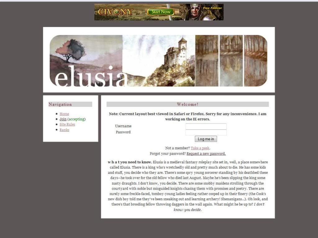
Holy Simplicity, Batman! There's like 7 links on the site... and that's counting the advertisement on the top! On the front page is a paragraph which is also on the AD but considering all the writing that is on the AD I'm sure some people may have skipped some of it. Small thing here, perhaps another space would be needed for the "w h a t you need to know part" to make it look nicer. (As opposed to: "w h a t you need to know")


The Content:
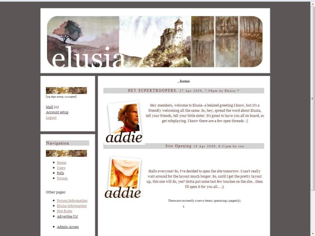
While there is technically a private and public area, I'm condensing the two because there isn't much information on the public side to comment on.

The Site Rules, Alrighty I already have a problem with the rules page. There are two stated rules which are fine but the other rules are unwritten. They say these are common sense, but as much as I like to believe in the human race we all know that 9 out of 10 people don't have this. Especially in our selective community...

(For you slower people out there that means I'm calling 9 out of 10 of you stupid.)

The Ranks page, it is as it states the page which lists all the people you can be. I would suggest that perhaps you split up the ranks page into 3 divisions and include hotlinks. Maybe order them alphabetically or something.

From now on is technically the private area but I feel these areas should probably be in the public area as well since it impacts the user before one applies for the site.

Forum information, first of all this page needs hotlinks there is way too much information on here to NOT to. It's already divided into sections anyway, so a simple anchor tag next to these will make easy divisions. In the beginning there is a little FAQ about the forums that answer some questions one may have about it. Afterwards there are all the listings of the areas of the forum. (I'll go into more detail into this in the forum section) There is also a map for each area which is nice for a visual aid.

Elusia information, is all the information about the area and background that you really should know before applying. As I've said before I think this should be in the public area as well. No problems here, but again there is a map which is nice.

The Application:
The application is true to the site's mission: easy and simple, so it's your standard fare. NO SAMPLE REQUIRED!

Forums:
There are 6 forums, 3 OOC and 3 IC. Now as I've said before I'm going into a little more detail about this system. In the forum information page, there is a list of areas in the large area. The one large forum encompasses all the areas listed in the information page and as thus you can go from area to area without switching boards and whatnot.

Alright, I understand the whole simplistic nature of the site and wanting to go against the grind. However, sometimes this backfires and creates more confusion and too simple and not enough structure is bad as well. In my opinion this is a case where the idea is good, but the bad outweighs the good, if any. Most sites expand the areas of the forums to acheive this and if you want to move then creating a new thread isn't all that hard. The burden is too heavy on the roleplayer and doesn't take advantage of the structure provided by the AR system.

In short: I'm not a fan of it.

Other:
The member list is plain but I have no problems with it, the profiles are rather plain as well but are generally filled out nicely.

Roleplaying:
From what I read on the forums I categorize the roleplaying on this site to be Intermediate.

Rating: 6.0 out of 10 Points.

Overall I'm rather torn, I'm all for going against the trends but sometimes the reason their trends is because they work and they work well. This is the case for several things, and especially for a medieval fantasy RP which I think is rather simple anyway. Moving that simple nature even more upsets the balance with no real plot guideline. Perhaps throw in a small plot that someone is trying to take advantage of the king in his sick state, but I'd like to see some spark that I can latch onto aside from: "Well what am I doing today?"


Reviewed by: The Jello Emperor
Creations Between Worlds [9.4/10]

|


http://cbw.acornrack.com/


This Tuesday I, Professor Jello will introduce you to world of Pokèmon! Pokèmon are wonderful creatures that can become great friends in our journey to becoming-- Alright, that's enough of that... but seriously the next site is a Pokèmon site named, Creations Between Worlds!

*cue pokemon theme music!*

Alright, everyone done picking their name and their rivals? Well too bad! I've already left Pallet Town for greener pastures! The AD for this site basically says "just look and be amaz-ed!" and of course all of us that love Pokèmon will check it out. So no waste and no worries about writing a long AD, this approach works well with a specific audience like this. Well maybe Gary will be nice enough to give you a ride to the next few towns because I've already made it to Saffron City, and don't forget your extra underwear!

First Impression:
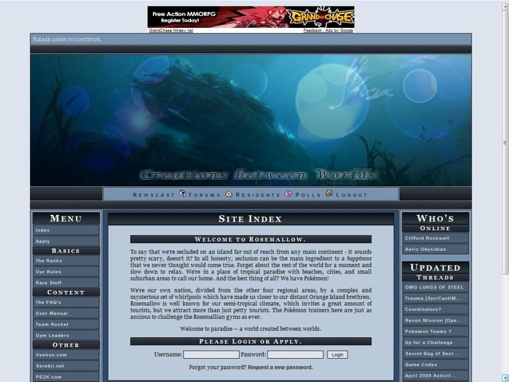
Ba-by Lu-gi-a in the deep blue sea, swims so wild and he swims so free! The layout for the site is very nice and organized but somewhat like Trip it is nostalgic because I've used such layouts many moons ago. No real problems with the layout aside from obvious flaw, there's no link to this review site or my AD! Pfft, Negative -100 points! Just kidding....a little bit.... >_> Seriously though, the whole right column is dedicated to updated threads.. which I think is a bit much.

The Content:
The Ranks page obviously holds the ranks and is nicely organized with nice picture references. No problems here.

The Rules page, plus paragraph! The rules portion is divided into different sections no major problems except that I really dislike the use of profanity in the public area. Especially with a family friendly franchise such as Pokèmon language should be watched.

Rare Stuff, clearly outlines all the rare items and Pokèmon as well as how to obtain them, so there should be no disputes. I personally would have loved to grab 6 Eevee's and be an "Eevee Gym Leader."

The FAQ page, before I get to the comments I would like to suggest a Cbox. Har har, I am an advocate of the more interactive communication you get with a Cbox or Chatango. I have no real problems with this section. (Note: This was intended as a joke... I know it says in the FAQ there is no chance. So... har har.)

The User Manual should be look over 4 or 5 times because IT IS IMPORTANT! I just thought I'd help out a bit by pointing out that knowing that manual like you wrote it would be beneficial for you. No problems here.

The Team Rocket page, nicely explains everything. No problems here, I did notice that the RedLetter inc wasn't there when I was around... I think..

The Gyms Page, These people sure have high leveled Pokèmon! A beginning trainer is going to need like one year before attempting this league. That would be my first problem, the levels are too high. Second, I'm not the Forsythia Gym Leader. Third, while having the image description show levels, it's nowhere said that if you hover the levels will be shown. Also, it wouldn't be that hard to write "Lv. 20" or whatnot would it?

The Application:
Aside from some odd... things they ask you in the application it's your standard fare, however the part about the Dark and Water Gym Leaders needing applicants isn't current. I'm sure I saw a Dark team in the lineup. ROLEPLAY SAMPLE REQUIRED

Forums:
There aren't too many forums however the long descriptions decieve you! The forums are large expanses of areas though so it isn't too much of a problem. With the long descriptions it's difficult to navigate, so perhaps a forum splitting script would be good for this.

Other:
Member list is plain and shows a little bit of info on them. (Their age?) The profiles however are the opposite, divided into 3 sections and generally are filled out very nicely.

Roleplaying:
From what I read on the forums I categorize the RP level of this site to be Intermediate to High Intermediate.

Rating: 9.4 out of 10 Points.

Overall the site is very good, I have little problems with the site and most of the ones I do have are space issues. Obviously the detail and little pictures to help explain everything or just adding color to the site give it the polish it needs to get the high points. The leveling system is functional but it seems to be it could use more tweaking.

This Site has the Jello Seal of Approval!

Reviewed by: The Jello Emperor
TRIP [9.5/10]

|


http://www.trip.acornrack.com/


On this Thursday I bring you a website tha- *falls over* ... looks like something gave me a little TRIP there! Physical web humor doing anything for you? Anyway, today's website is called.... TRIP! It's a cyberpunk, future RP so you should all watch The Sixth Sense with Bruce Willis! (I really had no point or joke there... I just like that movie.)

The AD for Trip is well written and while I'm not much of a cyberpunk RPer, the mention of Cyborgs (Is the term "Mechanically Enhanced" the politically correct term?) is something that caught my eye quickly. It has the standard "wealthy above the clouds people oblivious to those underneath" and for some reason I keep thinking about the Jetsons... Meet George Jetson! Jane, his wife! Daugh-ter Judy! The Anarchist Elroy! (Hey! I needed someone to cater to the ground people!) Okay then, lets grab our phasers set them to kill and then- *trips again* ... Gah!

First Impression:
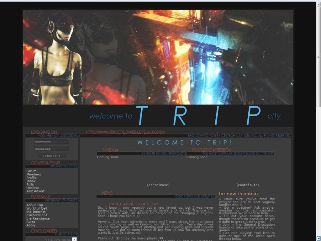
Robocop's wife is the mascot! The layout for me looks very classic, much like the ones I used to make in HTML when I used Angelfire way back in the day, it's a nice touch to add the URL thing on the page and as well in the title coding. Depending on how the NASSA24 thing and the Chatterbox is executed it may look like there is too much information and things on the initial screen but overall it looks like and "tech-y".

The Content:
The About page is an expansion on the AD giving you more reason to why the Rebellion exists, why they are losing people and all that important plot stuff.

The World page tells you about the world, of course! The technology, how things work in the city, what kind of interesting people and different ethnic races. Overall this page is fine, it has great information but, I've always liked having topics distinguishable from the actual text. So when "Internet; text text" comes up perhaps the "Internet", portion could be white. However, I can understand wanting the site to have a monochrome feel.

(Word Error: 2nd sentence in the NASSA section, "The use over hover cars" , should be "of" not "over" or something to that nature.)

The Internet page expands on the new age internet, on how all of that works with the story and all the fun stuff like that like the 3 methods of getting online. I just have the same comment from before on aesthetics but not a big deal.

Corporations page explains more on the relations and doings of each corporation, I would have liked to play a Ghost personally but I'm sad that you can't. Overall no problems here.

The Resistance page I have no problems with, it talks about the leader of the group and their doings.

(Grammar Error: 2nd paragraph, "keeps the motivated", "the" should be "them")

Rules page, I have 000 problems with. (That's a Trip site reference if you didn't get that...)

The Application:
Before the application there are a few more things to read, RP SAMPLE REQUIRED. No problems in this area.

Forums:
There are little arrow thingies next to all the forums! No real point here, I just like them... Not too many forums but each forum covers a large expansive area so this is fine. The descriptions for each forum is also very nice. Also, hooray for hotlinks! (Also there is a nifty image for the user levels in the forum, which is as I said, nifty.)

Other:
The member listing for the site is rather plain, just the avatar and a few bits of information, but just because it is plain doesn't mean it's bad. I don't really mind this, since all needed information is here.

Member profiles are well organized and generally filled out well. There are some here and there that haven't been filled out completely however.

Roleplaying:
From what I read on the forums I categorize the RP level of this site to be Intermediate to High Intermediate.

Rating: 9.5 out of 10 Points.

The attention to detail and just it's overall presence is the reason for the rating. Coupled with the fact that this is one of the few cyberpunk RP's out there this one will surely attract many. While the plot itself is rather expected I don't think it takes away from experience because of the lack of said sites so the pool isn't saturated with these plot lines. The only real major complaint I have is the index page being overstuffed with information, the news and chatterbox and the site news and quote and et cetera. And of course, NOT BEING ABLE TO BE A GHOST! O_O ... kidding! =P


This Site has the Jello Seal of Approval!

Reviewed by: The Jello Emperor

Hollywood [8.0/10]

|


http://www.acornrack.com/hollywood/


On this Tuesday I bring you this site under the spotlight and under the eyes of many people, Hollywood! We've all had our fun I suppose making fun of these celebrities and wishing we would have the life and glamor and beauty of certain celebs. Well you still can't do that, BUT, you can continue to dream the dream in this RP site.

The AD for this site is rather... well I'll just say it plainly, I'm not a fan. It's all centered so it makes it difficult to read and it's double spaced so it just takes up way too much room in my opinion. But otherwise it fine, it's written so people will be interested to join and gives a good description of how the idea of the site is. But anyway, call your private jet and tell your publicist to meet us at the start of this review!

First Impression:
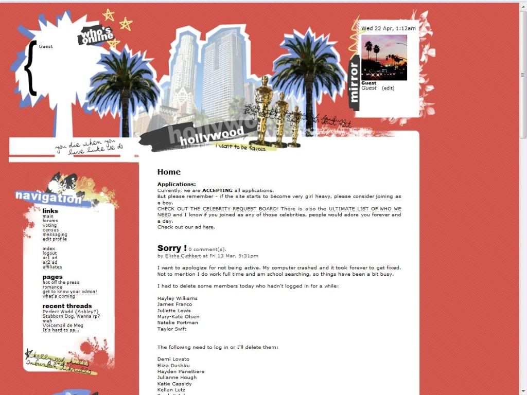
I want it all! I want it, want it, want it, my name in lights in Carnegie Hall, I want it all! (Finally worked a High School Musical reference into one of these!) Overall the layout looks nice and clean, perhaps I'd like it centered on the screen and a slightly wider text area, but that isn't a big thing.

The Public Area:
The front page has the AD blurb reposted and again, I have no problems with this sort of thing.

The About page has a further longer explanation of what was already said, I don't really think this sort of thing needs to be said twice. This page also contains the ranks for the site, no big problems here though.

In the Rules page the rules are separated into categories and this is why I would have liked a larger text area, the rules look all squished together and it's a little hard to read but overall no major problems.

The Application:
The site has a quite small application (probably to accommodate the small text box!) Just name, rank, RP sample and the "Word." I would have maybe have liked to see a drop down menu for the ranks just for aesthetic purposes, but not a big deal.


The Private Area:
Time for a Layout Extension! Basically it just extends downward and gets rid of the text area problem of the public area. I was unable to read the private pages, so I cannot comment on anything else at this point. I was sad I was unable to learn about more of the admins, I'm always on the lookout for potential internet girlfriends. (Am I kidding? You decide! AcornRack Votes 2009!)

Slight note: Maybe it's me but I get annoyed when the links aren't capitalized, so I'm just going to throw that out there also.

Forums:
Good amount of forums and good descriptions and I like how the forums are styled to match with the rest of the site, so aesthetically it looks very nice. But again, with all these forums it almost begs to have hot links to each individual section, scrolling all the way down is a pain at times so invest in those or a script that breaks up the forum into parts.

Other:
The Member list is fine, showing an avatar of the celeb and a little bit of info on there as well, no problems here.

The profiles themselves are nicely organized into sections and are generally filled out, the extra pictures open in a separate window which is fine. So no major problems here either.

Roleplaying:
From what I read on the forums I categorize the RP level of this site to be Intermediate to Advanced.

Rating: 8.0 out of 10 Points.

This site has a good concept and is looks very nice however I think that the gimmick of being a celebrity/journalist needs to ends at some point and the RP itself needs to take over as the driving point and I myself didn't really see that happening. It's still a good site, however I believe it can improve much more and be one of the bigger RPs out there.

This Site has the Jello Seal of Approval!

Reviewed by: The Jello Emperor

Sunset Beach [7.0/10]

|


http://www.acornrack.com/sunsetbeach/


The next site on my list is Sunset Beach, a city rp based in the lovely state of Hawaii. I've never been there though so I guess I'll have to graciously accept a complimentary trip to Hawaii from the owners to fully see the parallels between the actual experience and the site.
(Obviously I'm joking... but wouldn't that be GREAT?!)

The AD is nicely written out, telling you that again it's located in Hawaii and throwing in the "AD" portion trying to draw you in to the site. Now that we've gotten that established, drop it like it's hott (with two "t's"!), show me your bikini, and lets head onwards to the review of Sunset Beach!

First Impression:
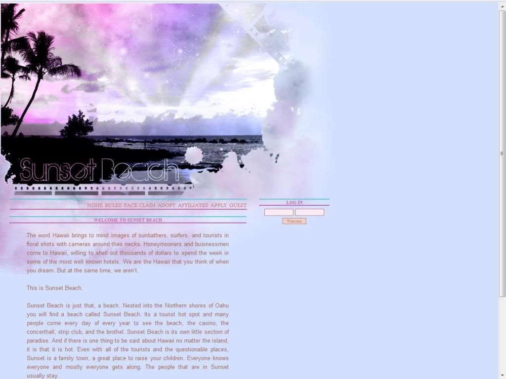
I've got a lovely bunch of coconuts! (That's what she said!) The layout is very nice and simple, a nice image on the top with links under it. And the colors look like it's emulating a sunrise or sunset. So overall very nice.

The Public Area:
The Front Page is a rehashing of what was posted on the AD and that's fine, so no problems here.

(Spelling/Grammar: "concerthall" is two words, "dont" needs an apostrophe)

The Rules Page is split into 3 sections for easier separation of rules. Overall it's your standard gambit, so no problems here.

(Spelling/Grammar: "instant massagers" should be "instant messengers", and OCC should be OOC in Rule 2. [Both Errors] )

Face Claim Page, Adopt and Affilates page are self explanitory, moving on.

The Application:
The Application is the standard that generally everyone has, however NO RP SAMPLE REQUIRED. (Jello Points for you! ... it's like Brownie points.. but I'm Jello.)


The Private Area:
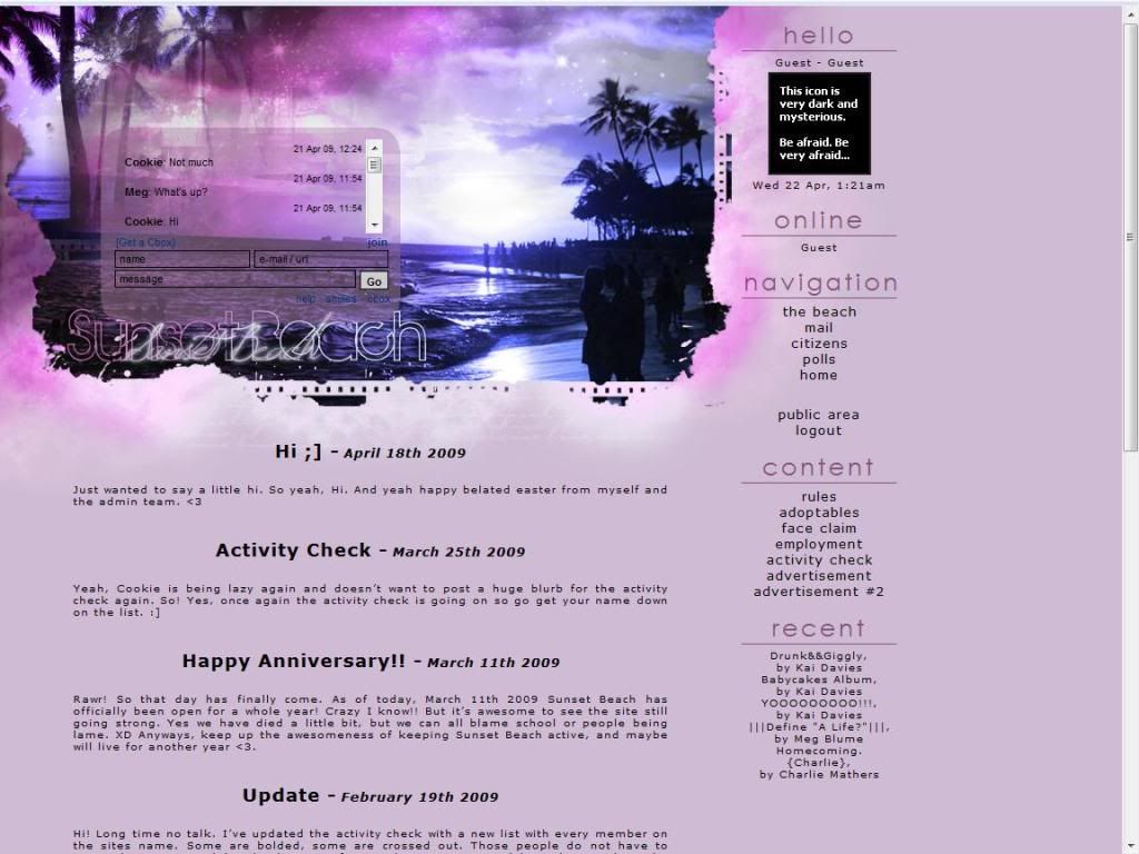
Layout Extension! Woo! Basically there is a navigation bar on the side now so everything still stays nice and simple. Everything for the private area is on the intial screen load so that's also nice. As with most City RP's they generally do not have private pages so that means less work for me and onwards to the next section!

Forums:
Good amount of forums and each forum has a nice description however this is where I have my first little nitpick for the site. The forums for me seems like a giant text block, aside from the large text separating each section the actual forum names, and descriptions seem to mash together and there's no clear definition of their space. I see the little ">>'s" before each name but it still feels like it's hard to navigate. This brings up my next point, with great forums comes great unnavigability (Booyah! Spiderman reference!). The scrolling is somewhat of a pain since the descriptions are in fact good, so the good turns into the bad in this case. I've always been a fan of hot links to each individual section and subsequent hotlink to top, or the script to separate forums entirely.

Other:
Member list is organized fine, showing the avatar and a short bit of information on each. The names themselves aren't links so for me that was 10 seconds of staring at the screen but I quickly noticed the outline of the pictures as the links.

Member profiles are nicely organized and are generally filled out well, though there are some who have been on a month and their information is still "coming soon."

Roleplaying:
From what I read on the forums I categorize the RP level of this site to be High Intermediate to Advanced.

Rating: 7.0 out of 10 Points.

Overall Sunset Beach is a good site with a nice layout and where I think the simplicity makes it all the more better. The Gossip accounts are also nice and adds a bit of uniqueness to the site, however after that point in the end it is a city RP. The location obviously gives the opportunity for nice events along the way to encounter celebs or international stars (hint hint?). Don't worry, the first one's free, tell your friends. (No really, I could use some publicity...)

Reviewed by: The Jello Emperor

Lachrymose [7.0/10]

|


http://lachrymose.acornrack.com/


Marking the second review upon my return, the site that is next on my list is a Dark, Modern, Fantasy RP lightly based on the video game, Devil May Cry. Now since I have no previous knowledge of the game, I'm effectively eliminating any bias if they've changed or edited things from the game whether it be a positive or negative response.

The AD more or less is just a small blurb of background story, and even though it is quite short, I'm all for the idea of short and sweet ADs. Even though I have no idea of the previous games' stories or whatever there is enough text and information for me to understand what the RP is about which is all you really need in an AD. Furthermore, there is a small trailer posted on youtube as a supplement. Since this review is on the site itself, I will not give any comments on the trailer. Alrighty you better hunters, go track the start of the review for me! Don't shoot it though! Capture it alive because people still need to read it!

First Impression:
I smell a Magical Mew. Magical Mew's layout's are generally built the same way in all the sites I've seen them on and I have no problems with them. If it's not broke, don't fix it! (Edited for proper English, FTW!).

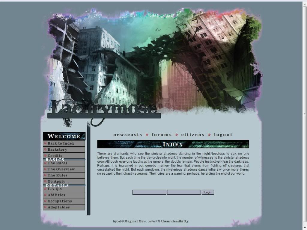
The Content:
The Index page has another little blurb for you to read, and at this point I'd like to point out some that the text is formatted weird so that some words are still together when they should be separated, or there are no spaces after periods.

Backstory - This page obviously has the backstory of the site, and I want to point out that to hitch a ride on a vehicle unannounced is called a "stowaway" not "stole away". The story as a whole is fine but it was a fairly quick jump from 4 years ago to "now" so perhaps a little tidbit to expand on that portion would be nice.

Races - Your basic races information here, given with some background information and some knowledge on what they can do as a force in the world. However this is where I have my first nitpick. The devils portion in the note it says that dragons will be declined solely because of the fact they are not incarnations of a devil or something to that effect. Satan (aka The Devil) has been referred to as a dragon multiple times so in fact a dragon is not a spawn of a devil but more over THE devil.

(Spelling Error: 3rd word, last line in Humans.)

Overview - This page basically states that this is a freeform RP, and there is no preset plot for you to follow. I'm a fan of another method myself, but I find this method generally works fine for a beginning site well.

Rules - Overall fine, I have no problems on how it is written. However I have two problems within the rules. First, You say you allow swearing then say you'd like to not use certain words. It is of my opinion that you can either accept them all or none at all. Just because they are "extremely offensive", is being based on individual perception.

Second, you say to use your powers responsibly because your character are not Gods. So I will now point out my problem. Humans are obviously the weakest in terms of strength on the site, however Sinner Demon's can kill them "relatively easy" and "they (Sinner Demons) are "nothing compared to that of a Devil". While Valkyrie's are not painted in this picture from the rest of the text it seems to me that Devil's are clearly Gods in comparison to Humans and Sinner Demons.

FAQ - Your standard Question and Answer section, so not much to say here besides the fact that I am an advocate of having a Chat of some kind on a site.

Abilities - Unique abilities are fun, and gives another layer of character to a character itself. Not much to say here except this is what my 4 abilities would be (Since 3 minor ones are required for the 1 major).

Major: Silencing (Nullifies Magical powers)
Minor: Physical Strength, Weapon Master, Heightened Reflexes.

Occupations - Self explanitory, words here are oddly spaced as well as in the index however.

Adoptables - Self explanitory also.

The Application:
More or less your standard fare, RP Sample Required but can be from another roleplay.

Forums:
I can't comment on this because I am unable to see the IC forums.

Other:
The Member list is more or less the basic list just separated into user rank (Human, Valkyrie, etc.).

The Member profiles themselves are divded into 3 portions separated by script, and are generally nicely filled out. Some members at this point haven't filled all of the fields in and others seem to have put a few things here and there.

Roleplaying:
Unable to comment on.

Rating: 7.0 out of 10 Points

Overall it looks like a nice site but there is no real genuine feature that seems to draw me in personally. Nihilum has it's event system which I liked but this site to me feels a bit narrow in its target audience (Post-Apoc, DMC Players).

Reviewed by: The Jello Emperor

Liberation [8.9/10]

|


http://www.acornrack.com/liberation/


The next site on the list I've been personally excited about and it should be no surprise to the score to those whom are reading this review. I apologize to the owner for the lateness of the review but as we all know real life sometimes tears us away more than we want. Anyway, buckle your seat belts. NUMBAH ONE, ENGAGE HYPER DRIVE!

The AD for the site is very impressive, it gives a great background story and lots of information that gets you into that mood that the site wants you to be in. While the whole plot line of society vs. government has been done before I think, but this situation gives the idea more credibility. So overall I like it.

First Impression:
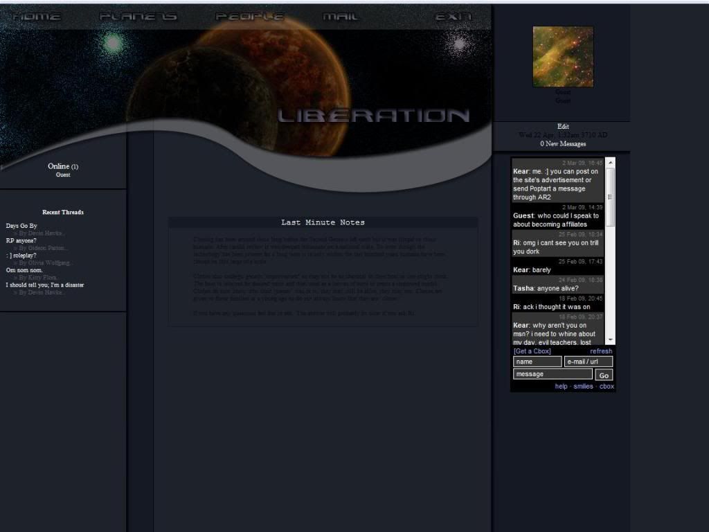
Looks Amazing. I love the layout for this site, it looks very professional and doesn't go into the stereo typical "left hand menu" or anything of the sort. If I didn't know better I would have guessed this was some sort of browser space game. (Not an RP of course.)

The Public Area:
The front page contains a small snippet of the AD which is nice, we've most likely read the whole AD so no need to repost the whole thing. Also, the text is a bit too small for my tastes but not much else.

The About Page, this is the history of the site or the plot rather. Only one small nitpick here, Justify the whole thing and it will look so much better.

The Weapons Page, is just a small little blurb stating that the weapons are up to YOU! I would have maybe liked to see a small selection of "standard issue" weapons given to police so they have some baseline of what officials would have and what may border on illegal parts and things like that. Again, Justify it.

Alliances Page is just a description of the two main forces on the site the Liberation and the Anarchists. The only problem I have with this is that there is no middle ground. Once again, Justify the text!

The Ships Page, this is where I run into a little trouble... this page basically lists the ships and specs and whatnot. However the centering and organization of this in my opinion isn't very good and it's hard to remain focused. So I simply suggest to (again, justify the text) and maybe do some reorganization to that page.

The Planets Page, is a basic listing of the planets and their characteristic and again I suggest justifying the text. Aside from that I think they should order the planets in a certain way, maybe by political influence from Hardcore Liberation to Hardcore Anarchist or just by their orbits. Otherwise, I have no problems.

The People Page, is basically the "ranks" page as most people would identify it with explaining the different jobs and positions on the site. Black text on dark grey background does not work for me. So perhaps change that color. In the boxes the text is justified! I love it!

The Application:
Before the actual application you get a few little guidelines which are in the stead of a dedicated rules page. This is an interesting idea and hopefully it works out for them. Otherwise the application is the normal fare.


The Private Area:
Layout Change! Very nice the links are at the top and everything is on the opening screen so there is no fishing for links. The only nitpick I have is that the links at the top are the same names as the information in the public area so that can create some confusion on where the forums are and things like that. There are no new pages of information so we'll just move onto the next section...

Forums:
Good amount of forums here however the text descriptions are black and again on a dark grey background it doesn't really work for me. Also perhaps some hotlinks to the different sections or using the script to divide forums would be nice to reduce scrolling time.

Other:
Member listing looks nice with the little plates behind the information, but where the site shines is the actual member profile. The profile opens in a new window with all the information and doesn't take you away from the main site. Again the only minor nitpick is the black text on dark grey background.

Roleplaying:
From what I read on the forums I categorize the roleplaying on the site to be Intermediate to Advanced.

Rating: 8.9 out of 10 Points

Overall I really liked this site, the idea was fresh the look of the site was very professional but the small text and the layout of the text made it hard to read so the score suffers very slightly from that. Liberation is nipping at the heels of JACFC but with a review of scores I may forsee another site passing over our current reigning champion.

This Site has the Jello Seal of Approval!

Reviewed by: The Jello Emperor