http://www.acornrack.com/liberation/
The next site on the list I've been personally excited about and it should be no surprise to the score to those whom are reading this review. I apologize to the owner for the lateness of the review but as we all know real life sometimes tears us away more than we want. Anyway, buckle your seat belts. NUMBAH ONE, ENGAGE HYPER DRIVE!
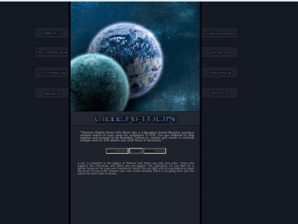
The AD for the site is very impressive, it gives a great background story and lots of information that gets you into that mood that the site wants you to be in. While the whole plot line of society vs. government has been done before I think, but this situation gives the idea more credibility. So overall I like it.
First Impression:
Looks Amazing. I love the layout for this site, it looks very professional and doesn't go into the stereo typical "left hand menu" or anything of the sort. If I didn't know better I would have guessed this was some sort of browser space game. (Not an RP of course.)
The Public Area:
The front page contains a small snippet of the AD which is nice, we've most likely read the whole AD so no need to repost the whole thing. Also, the text is a bit too small for my tastes but not much else.
The About Page, this is the history of the site or the plot rather. Only one small nitpick here, Justify the whole thing and it will look so much better.
The Weapons Page, is just a small little blurb stating that the weapons are up to YOU! I would have maybe liked to see a small selection of "standard issue" weapons given to police so they have some baseline of what officials would have and what may border on illegal parts and things like that. Again, Justify it.
Alliances Page is just a description of the two main forces on the site the Liberation and the Anarchists. The only problem I have with this is that there is no middle ground. Once again, Justify the text!
The Ships Page, this is where I run into a little trouble... this page basically lists the ships and specs and whatnot. However the centering and organization of this in my opinion isn't very good and it's hard to remain focused. So I simply suggest to (again, justify the text) and maybe do some reorganization to that page.
The Planets Page, is a basic listing of the planets and their characteristic and again I suggest justifying the text. Aside from that I think they should order the planets in a certain way, maybe by political influence from Hardcore Liberation to Hardcore Anarchist or just by their orbits. Otherwise, I have no problems.
The People Page, is basically the "ranks" page as most people would identify it with explaining the different jobs and positions on the site. Black text on dark grey background does not work for me. So perhaps change that color. In the boxes the text is justified! I love it!
The Application:
Before the actual application you get a few little guidelines which are in the stead of a dedicated rules page. This is an interesting idea and hopefully it works out for them. Otherwise the application is the normal fare.
The Private Area:
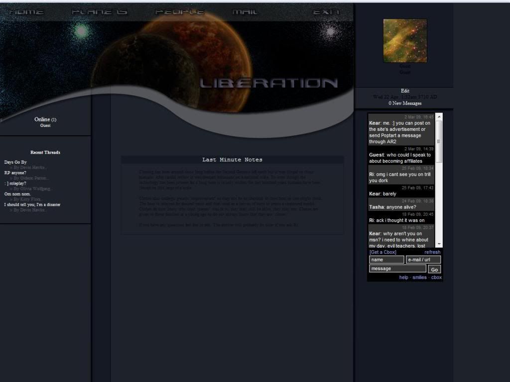
Layout Change! Very nice the links are at the top and everything is on the opening screen so there is no fishing for links. The only nitpick I have is that the links at the top are the same names as the information in the public area so that can create some confusion on where the forums are and things like that. There are no new pages of information so we'll just move onto the next section...
Forums:
Good amount of forums here however the text descriptions are black and again on a dark grey background it doesn't really work for me. Also perhaps some hotlinks to the different sections or using the script to divide forums would be nice to reduce scrolling time.
Other:
Member listing looks nice with the little plates behind the information, but where the site shines is the actual member profile. The profile opens in a new window with all the information and doesn't take you away from the main site. Again the only minor nitpick is the black text on dark grey background.
Roleplaying:
From what I read on the forums I categorize the roleplaying on the site to be Intermediate to Advanced.
Rating: 8.9 out of 10 Points
Overall I really liked this site, the idea was fresh the look of the site was very professional but the small text and the layout of the text made it hard to read so the score suffers very slightly from that. Liberation is nipping at the heels of JACFC but with a review of scores I may forsee another site passing over our current reigning champion.
This Site has the Jello Seal of Approval!
Reviewed by: The Jello Emperor
0 comments:
Post a Comment