http://glenbard.acornrack.com/
Alright my subjects, it's Thursday + a few days so you know what that means... Time for another review! Despite computer problems I'm still cranking these out but it figures that when I was basically on vacation for a week computer is perfectly fine and now BOOM! Problems. But I digress, this time we're reviewing a site called Glenbard!
Glenbard is an RP influenced by a few books and that make the concept of the site original in terms of that I've never seen one like it before. Maybe I'll have to coin a new term for this type of RP... Human Condition RP perhaps?
Anyway, the AD for the site is very nicely written and the plot idea is as I said original and quite intriguing. It's like Lord of the Flies but in a pre-civilized island. But anyway, grab your pitchforks and join forces with your local orphanage! The teenagers are coming! The teenagers are coming! (BOOM! I went colonial on your ass! ... and an orphan joke?)
First Impression:
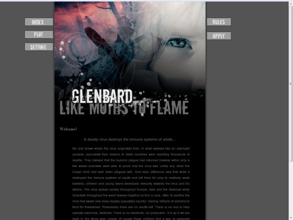
Staring Contest, GO! Anyway, I have no major problems with the layout but seeing that the screen is mostly the image and not information is a little off for me. I generally like most of the page to be information maybe like 40:60, image to text ratio.
The Public Area:
The index page is the story from the AD and again I have no problem with this so lets move on to the next section.
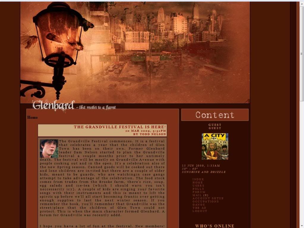
The Plot page gives a little more in depth of the setting a bit but what I personally got most out of it is that the main antagonists in this RP are the Deuces Wilde gang.
The Setting page gives us the setting, not much else to say here.
Rule Page, no problems with any of the rules here. I have a minor "thing" with one of the rules but as I'm trying to be impartial I'll just keep you guessing!
The Application:
The application is rather simple, for some sites it works and some it doesn't. And I'm on the fence about this one. Putting everything about your character in a single box seems way too simple for me.
The Private Area:
Layout Change! In fact it's SO different it's actually kind of disorienting, I see two new pages... I think. The site function links and the site info links should probably be separated, even though there are only two new info links it should be clear that it's info.
The two other pages in the private area are self explanatory so no need to comment on them here!
Forums:
Good amount of forums and descriptions here, but there are no hot links and as always I advocate them especially for lots of forums like they have here. The hover color link is the same as the background of the forum (The brownish...color) so that threw me off a bit.
Other:
Member list page is nice avatar and basic info.
Member profiles are organized nicely and generally well filled out.
Roleplaying:
I am unable to give an opinion on this, the individual topics were blocked from guest access.
Rating: 6.3 out of 10 Points.
The idea for the site was good... and then it sorta went downhill from there, it's hard to expand on something like this I suppose since it's a good plot + city RP + battery currency? . I can probably count on one hand how many city RPs I consider "successful" so this is difficult genre to make your mark in.
Reviewed by: The Jello Emperor
0 comments:
Post a Comment