http://www.acornrack.com/sunnyhs/
As we near towards summer vacation for all you people still in high school and such, we'll take our sights to a school that never closes for the summer! (Well maybe it does IC, I haven't actually looked at this point...) Anyway, the site I'm reviewing is Sunny High!
The AD is somewhat odd in the way that there is no "real AD." Rather it's basically an inviting sentence or two. For sites that are more reality based, (City, School, etc) these type of things actually work well. Alright everybody, grab your plate because these eggs are ready just like you ordered, Sunny High up! (Egg jokes are always full of win!)
First Impression:
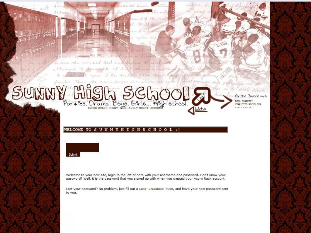
The football picture reminds me of the movie Facing the Giants. Anyway, the layout is centered and the colors look fine to me. There is however a few nitpicks I have right off the start. First I'm not all that big a fan of the image overlapping the links. Second, I have no idea where the links start and end so I'd like maybe more obvious separation between them.
The Public Area:
The index page has the default text when you create a site so I'd like to see that changed maybe some sort of minor introduction.
The Rules page to me looks unfinished, the rules aren't separated clearly enough in my opinion and I think maybe rewriting the rules to be a little more formal would be nice.
The Sunny High page is just the reposting of what is found in the AD more or less.
The Application:
The application is rather short, not requiring character descriptions and what not. The trade off on the easier application is the quality of RPers sometimes suffers though, so I guess you pick your poison. NO ROLEPLAY SAMPLE REQUIRED.
The Private Area:
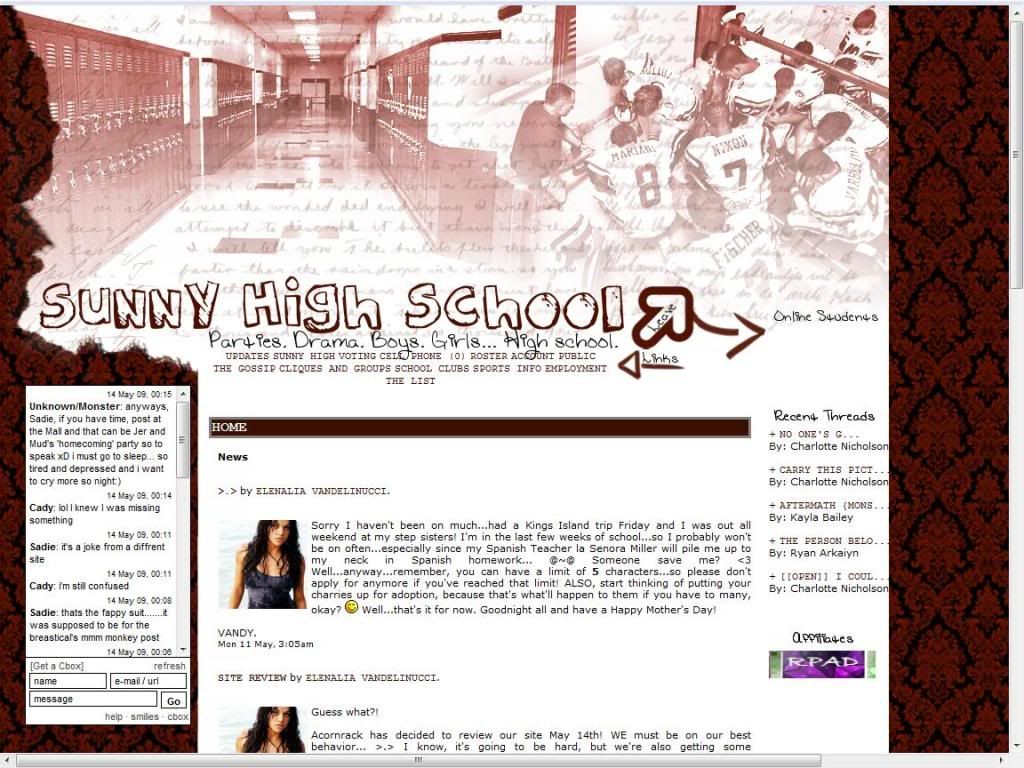
Layout extension with the addition of the cbox and recent threads portion. I still have my nitpick about wanting links to be more obviously separated and look neater. If you notice though in the picture you see the scroll bar for left and right movement. That may be something to look into after other things are finished.
Otherwise I cannot comment on the rest of the areas of the site because I don't have access to them. However, I've seen enough RPs like this to know what SHOULD be on those pages.
Forums:
There is quite a bit of forums here and again it's time to play the old record, I highly advocate the use of hotlinks to allow for easy navigation especially with a large amount of forums. It may be difficult to do this without clashing with the links at the top but it is definitely worth having them.
Other:
Member list has the avatar and little bits of info on the character as always.
Profiles are organized fine and are generally filled out well.
Roleplaying:
From what I read on the forums I categorize the roleplaying on this site to be Intermediate to High Intermediate.
Rating: 5.5 out of 10 Points.
Overall the site is slightly better than average but I don't really see anything that makes it stand out from the crowd. Some parts of the site seem incomplete and other parts just need more work in general. Probably good for the more casual RPer.
Reviewed by: The Jello Emperor
0 comments:
Post a Comment